Redesigning the Canvas Editor
Rewst's workflow editor was powerful but painful , visually chaotic, difficult to debug, and confusing for new users. I took ownership of the Canvas Editor redesign end-to-end, transforming it from a tangled builder into a clear, scalable automation platform used by 1,000+ specialists.
Company
Rewst
Deliverables
Hi-Fi Mockups
Design System
Handoff Docs
Duration
18 months
Tools
Figma
Miro
Jira
UserTesting.com
Team
Product Manager
Lead Engineer
QA
Role
Lead Product Designer
From a fragmented experience
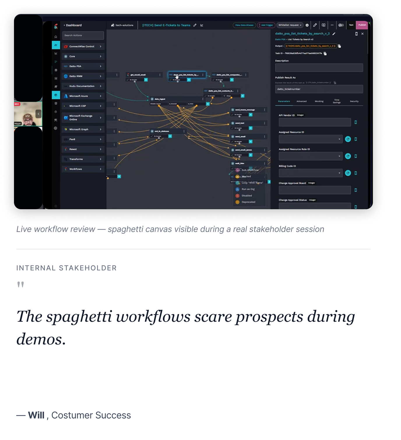
Visual chaos: Workflows looked like spaghetti with no organizing structure
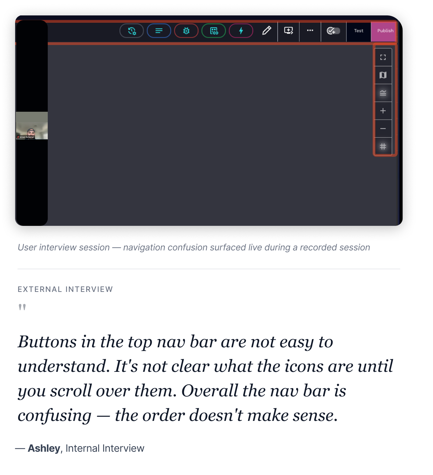
Hidden functionality: Triggers and key actions buried in unlabeled nav icons
No error guidance: Failures surfaced late with unclear messaging and no recovery paths
To a scalable builder
Instant scalability: Auto-layout and visual hierarchy make any workflow readable at a glance
Surfaces what matters: Triggers live on canvas, key actions are discoverable and labeled
Clear error states: Defined success, failure, and recovery patterns across every flow
Result
100%
Auto-layout adoption
All power users adopted auto-layout within 30 days of launch
65%
Faster scanning
Reduction in time to scan and understand complex workflows
3x
Faster debugging
Users debugged visually organized workflows 3× faster
Challenge
Redesigning a live, business-critical tool
At Rewst, I was tasked with reimagining the Canvas Editor — the core surface where automation specialists build workflows that their clients depend on. The tool was already in production, used daily, and deeply embedded in customer operations. Redesigning it meant doing so without breaking anything currently running.
I inherited this project after foundational research had been completed by another designer. My role evolved into owning the experience through validation, implementation, iteration, and delivery.
The goal was clear
Design a canvas that empowers automation specialists to build confidently, without visual noise getting in the way.
Understanding pain points
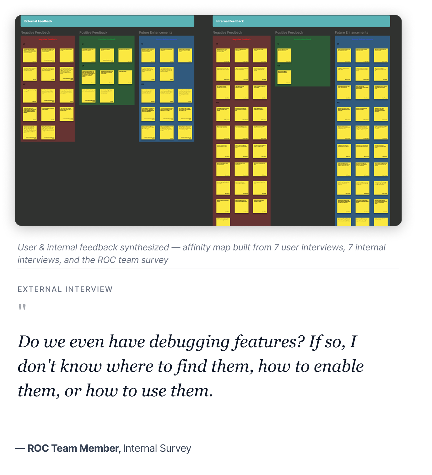
Through 7 internal interviews, 7+ user interviews, ROC team surveys, and Pendo usage data, I validated the inherited research and identified three critical issues that surfaced consistently across every source.
Visual chaos and no organizing structure
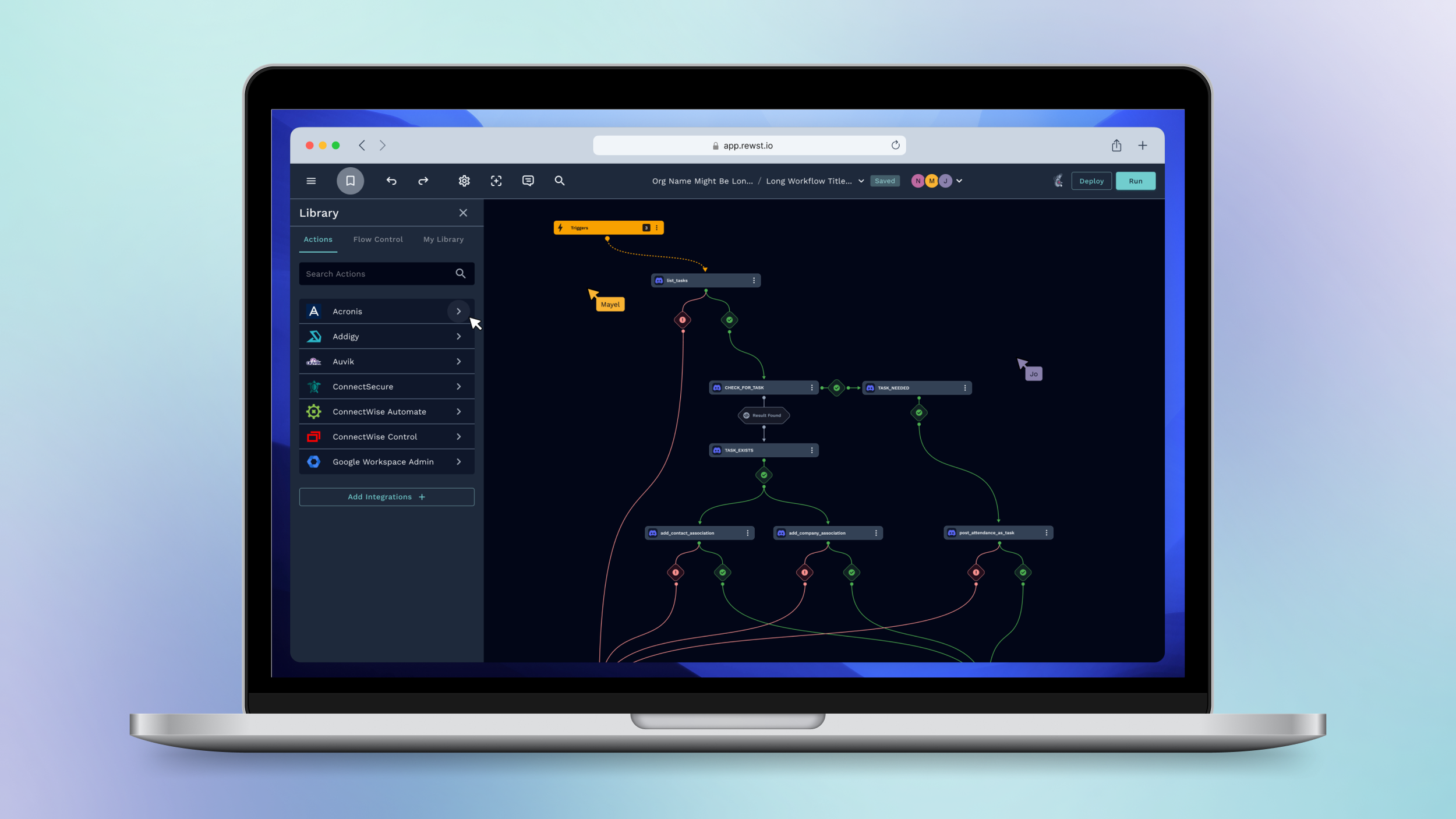
Users built workflows left-to-right because the canvas gave no scaffolding. Complex flows became impossible to scan. "Spaghetti workflows" was the phrase that came up in nearly every interview — and prospects were turned off during demos.
Hidden functionality and confusing navigation
Triggers, completion handlers, and key settings were buried in an icon-heavy top nav bar with no labels. Power users had workarounds. New users were completely lost, and onboarding took weeks of hand-holding to overcome.
Undefined error states and edge cases
Many scenarios — empty states, failure paths, conditional branching, recovery flows — were undefined in the original designs. As development progressed, these gaps became the #1 source of developer blockers and slipped UX quality.
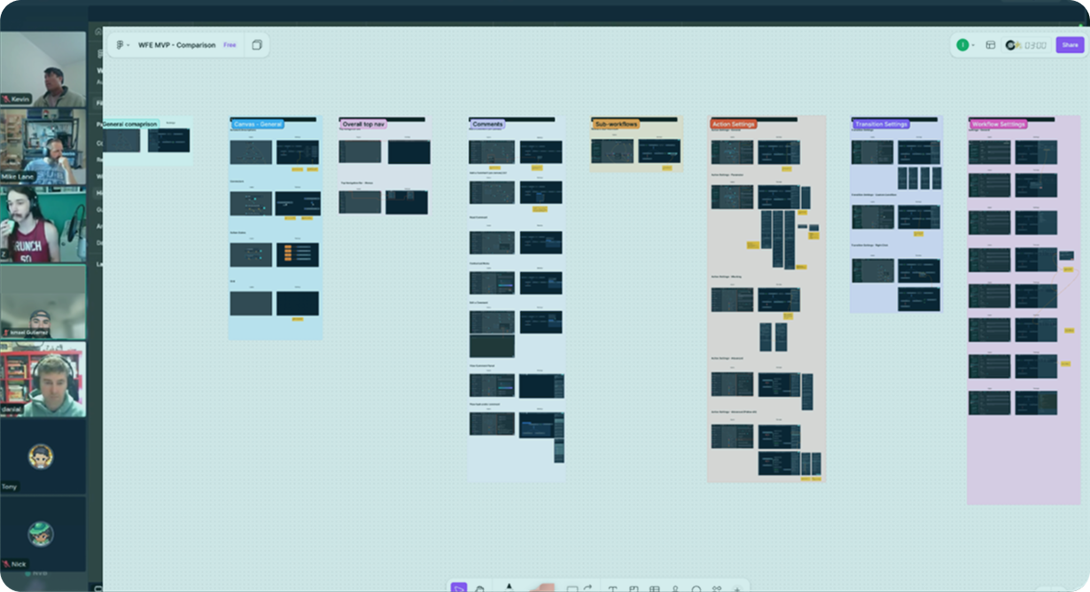
Cross-functional collaboration
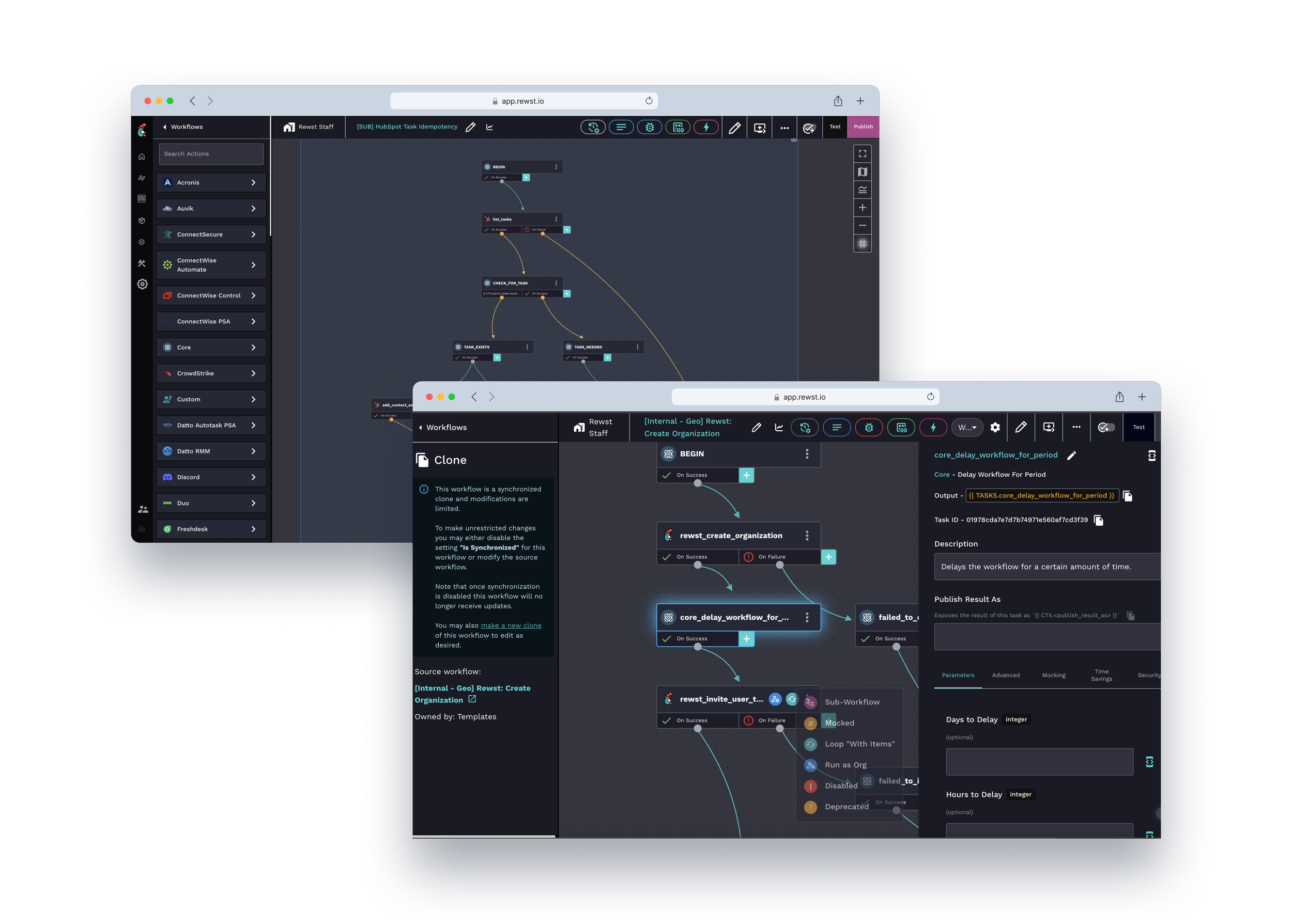
Designed and facilitated MVP scoping workshops with Product and Engineering to align on solutions, validate technical feasibility, and define clear delivery phases. One key outcome: introducing a Legacy Canvas toggle at launch — letting users switch between old and new canvas freely — so we could roll out safely without disrupting workflows already in production.
Solution
A holistic canvas redesign
I took a holistic approach to redesigning the Canvas Editor — preserving what users already knew while systematically improving the areas causing the most friction. Rather than starting from scratch, the goal was to raise the quality bar across visual clarity, navigation, and error handling without disrupting workflows already in production.
Design exploration
From broad to focused, I explored different design directions for the core canvas interactions — testing trigger placement, layout organization, settings panel structure, and sidebar behavior before committing to high-fidelity execution.
Key features
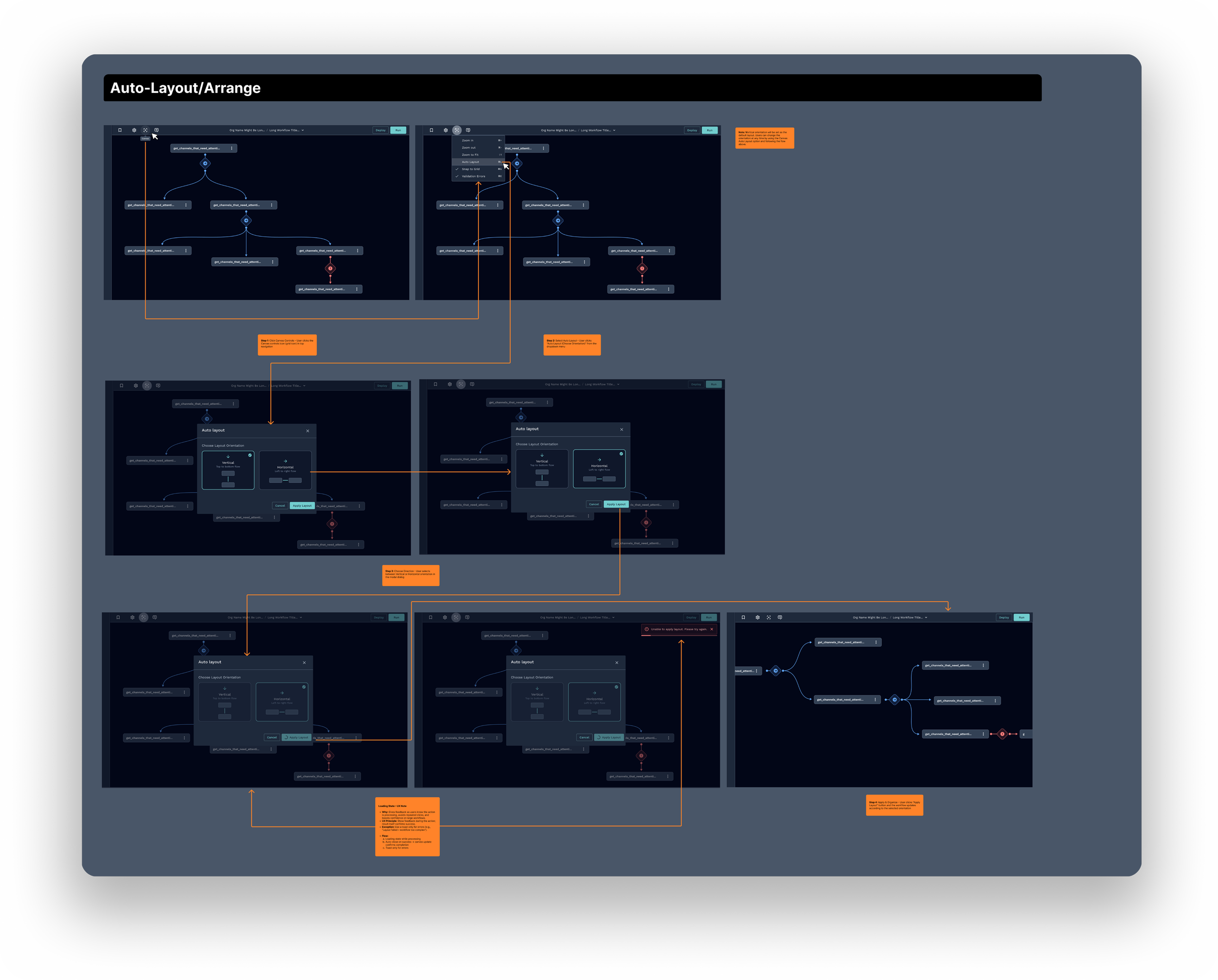
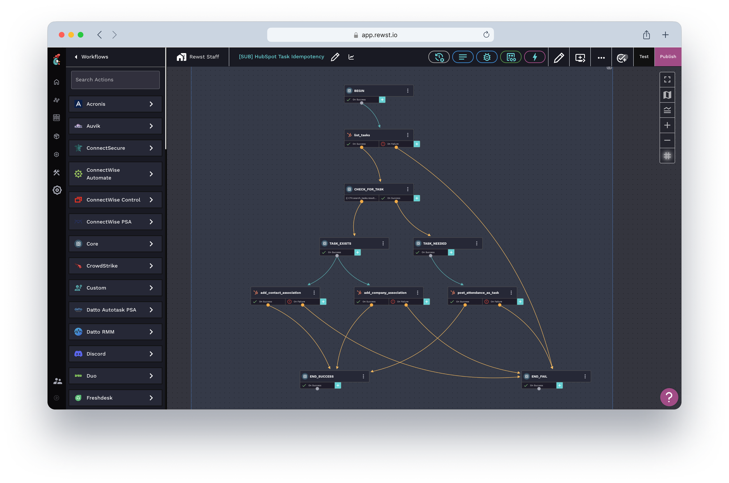
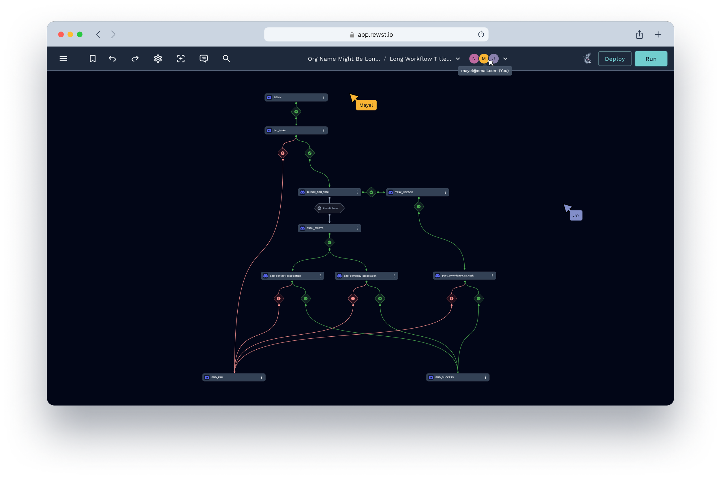
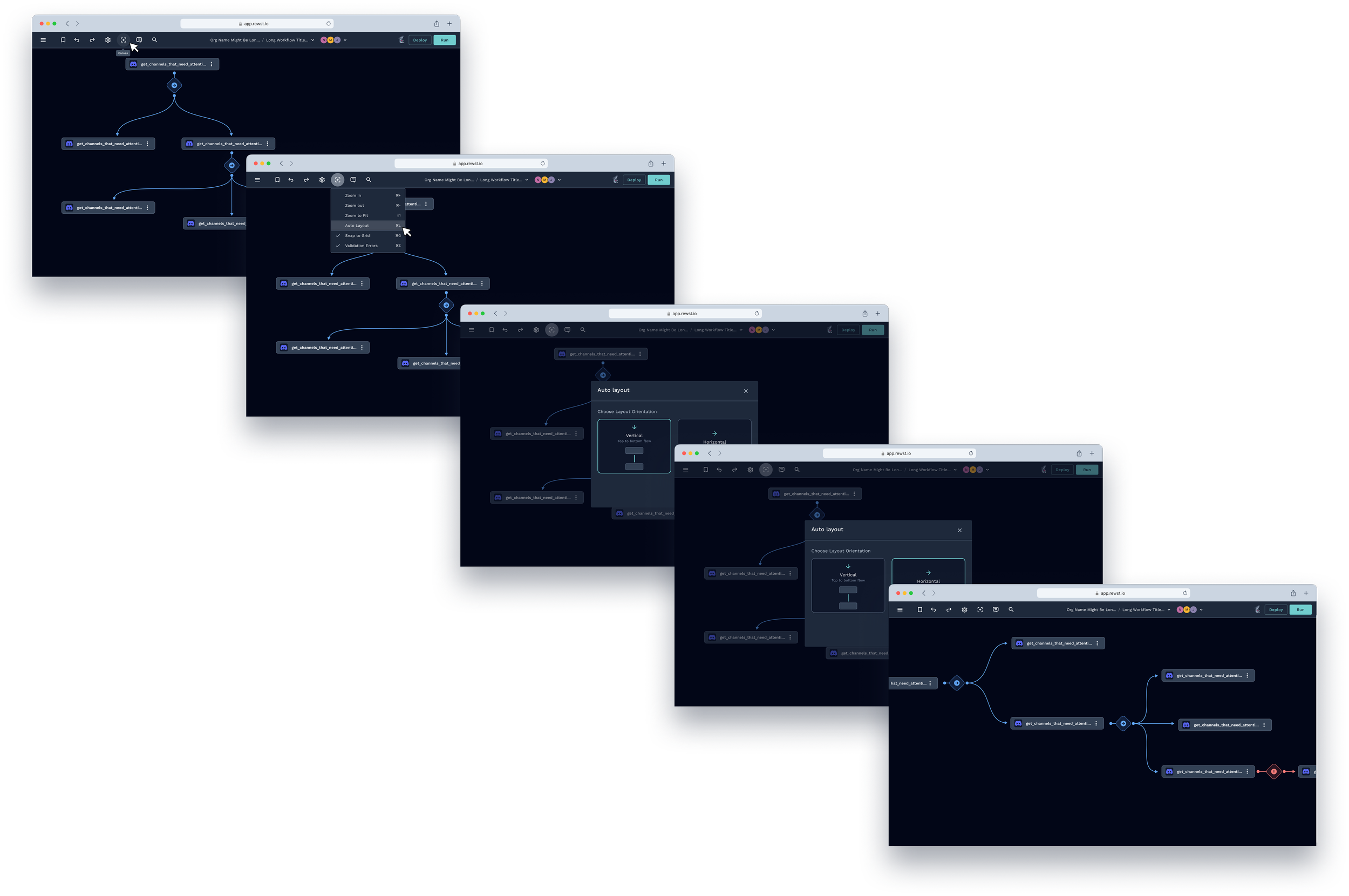
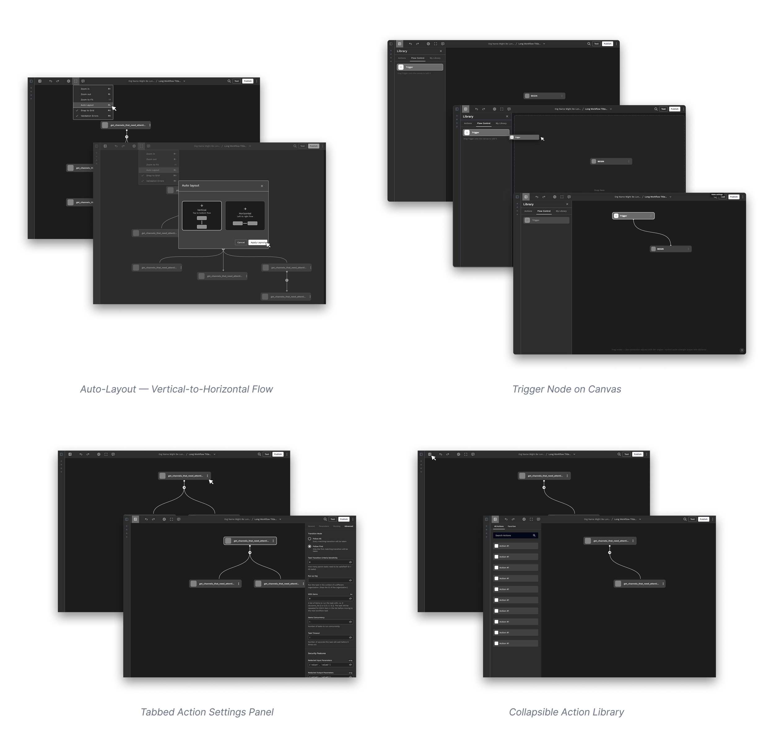
One-click workflow organization
Decision: Designed a one-click auto-layout feature that analyzes workflow logic and reorganizes nodes into a clean top-to-bottom structure with systematic spacing.
Rationale: Rather than giving users better manual tools, I automated the organization entirely. Removing the layout work drove 100% adoption among power users within 30 days of launch.

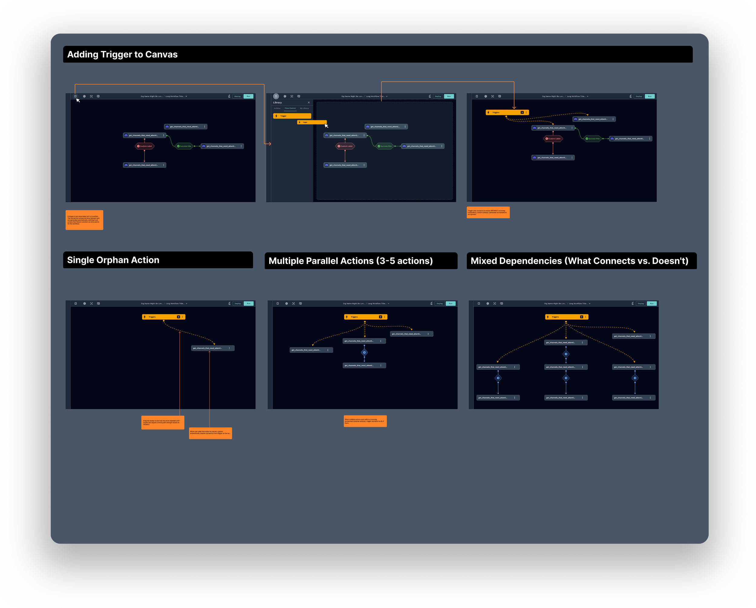
Triggers on canvas
Decision: Moved triggers from a hidden nav bar onto the canvas itself as first-class visual elements. Selecting a trigger opens a dedicated settings panel inline.
Rationale: Triggers were the most common source of confusion across all interviews — no one knew where to find them. Placing them on canvas made workflow logic immediately visible and reduced misconfigured setups.
Error states and edge cases
Decision: Proactively audited the full workflow to define UX for every state — empty, error, failure, conditional branching, and user recovery paths — before development began.
Rationale: Undefined edge cases were the #1 source of developer blockers during implementation. Mapping them upfront reduced ambiguity, prevented fragmented patterns, and kept engineering unblocked throughout delivery.
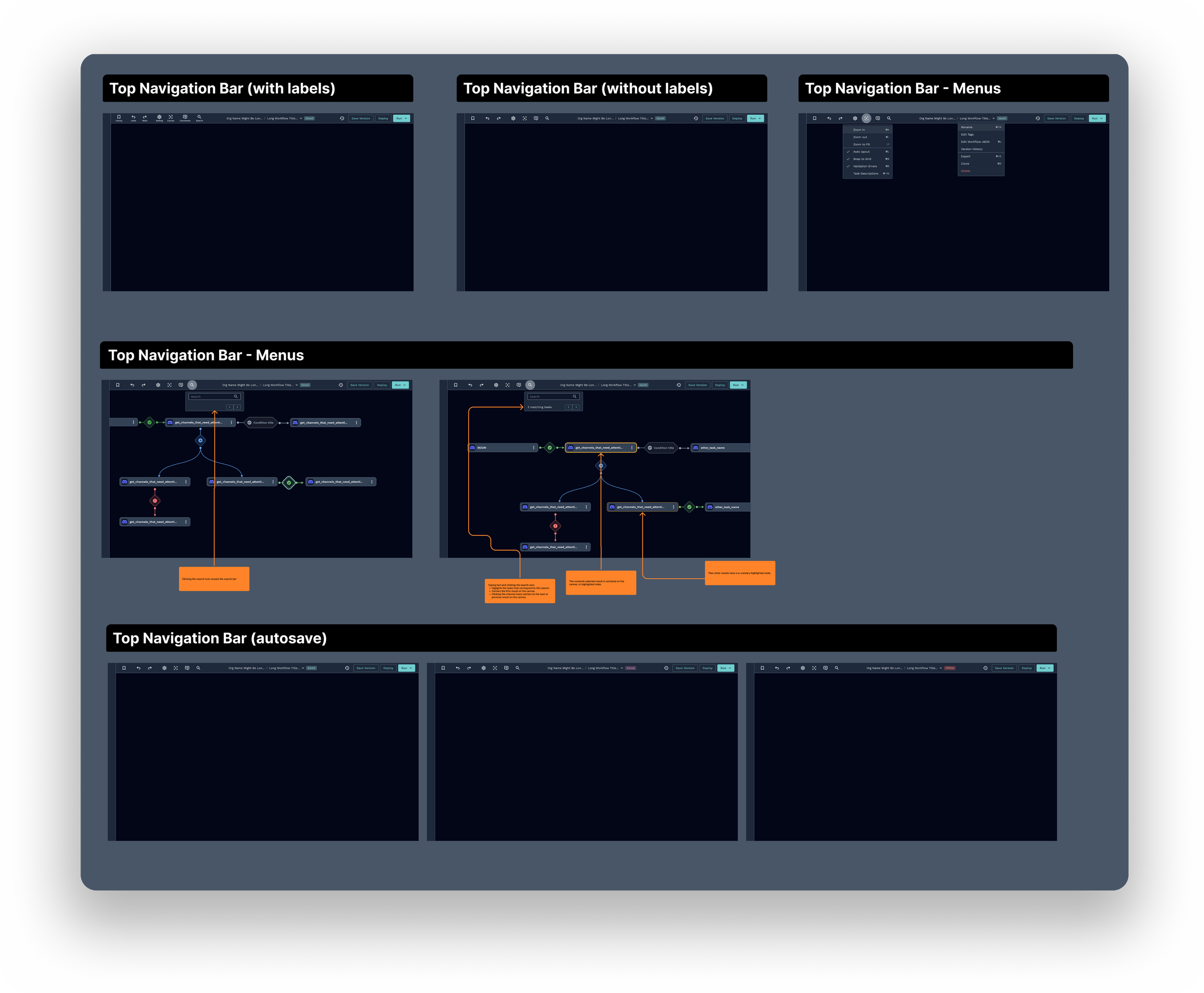
Simplified navigation
Decision: Reorganized the top bar by removing unlabeled icon clutter, grouping related controls, introducing collapsible sidebars, and improving action search — giving users more canvas space and clearer access to what they actually needed.
Rationale: The top nav bar was the most consistently cited pain point across every research source — internal interviews, external users, and the ROC team survey. Buttons were unlabeled, icons had dual meanings, and the layout broke on smaller screens. Simplifying it directly addressed the steepest part of the learning curve and reduced the need for onboarding support.
New canvas experience
The redesign transformed the Canvas Editor from a tool that fought its users into one that stays out of their way. Automation specialists can now build complex workflows, debug failures, and onboard new team members — without the canvas becoming the problem.
Shipped to beta users with a Legacy toggle so nothing in production broke. The metrics followed: 100% auto-layout adoption in 30 days, 65% faster scanning, 3× faster debugging.
What beta taught us
Legacy toggle — who's still on it after 90 days tells us exactly what to fix next.
Error states — defined pre-dev, but real failure logs will surface what testing couldn't.