Designing a dashboard that finally showed what the platform was worth
Rewst's automation platform was saving specialists hundreds of hours a week. The dashboard showed none of it. I took ownership end-to-end, running research, facilitating scoping workshops with Product and Engineering, and delivering a phased rollout that gave users the command centre they'd been asking for.
Company
Rewst
Role
Lead Product Designer
Deliverables
Research & Synthesis
Competitive Analysis
Hi-Fi Mockups
Phased Delivery Plan
Duration
12 months
Tools
Figma
Miro
Shortcuts
Team
Product Manager
Lead Engineer
QA
From a platform no one could read
No visibility:users had no way to see what was happening across their workflows
Invisible value:the platform saved hours of work but had no way to surface it
No early warning:errors and failures surfaced only after the damage was done
To a command centre for automation
Instant clarity:workflow performance, time saved, and integration health at a glance
Value made visible:time-saved metrics surfaced automatically across every run
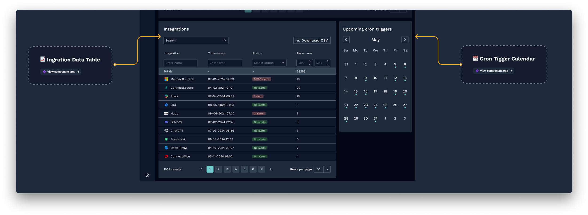
Proactive signals:cron triggers and integration alerts surface before issues compound
Result
100%
Adoption rate
All active users after launch
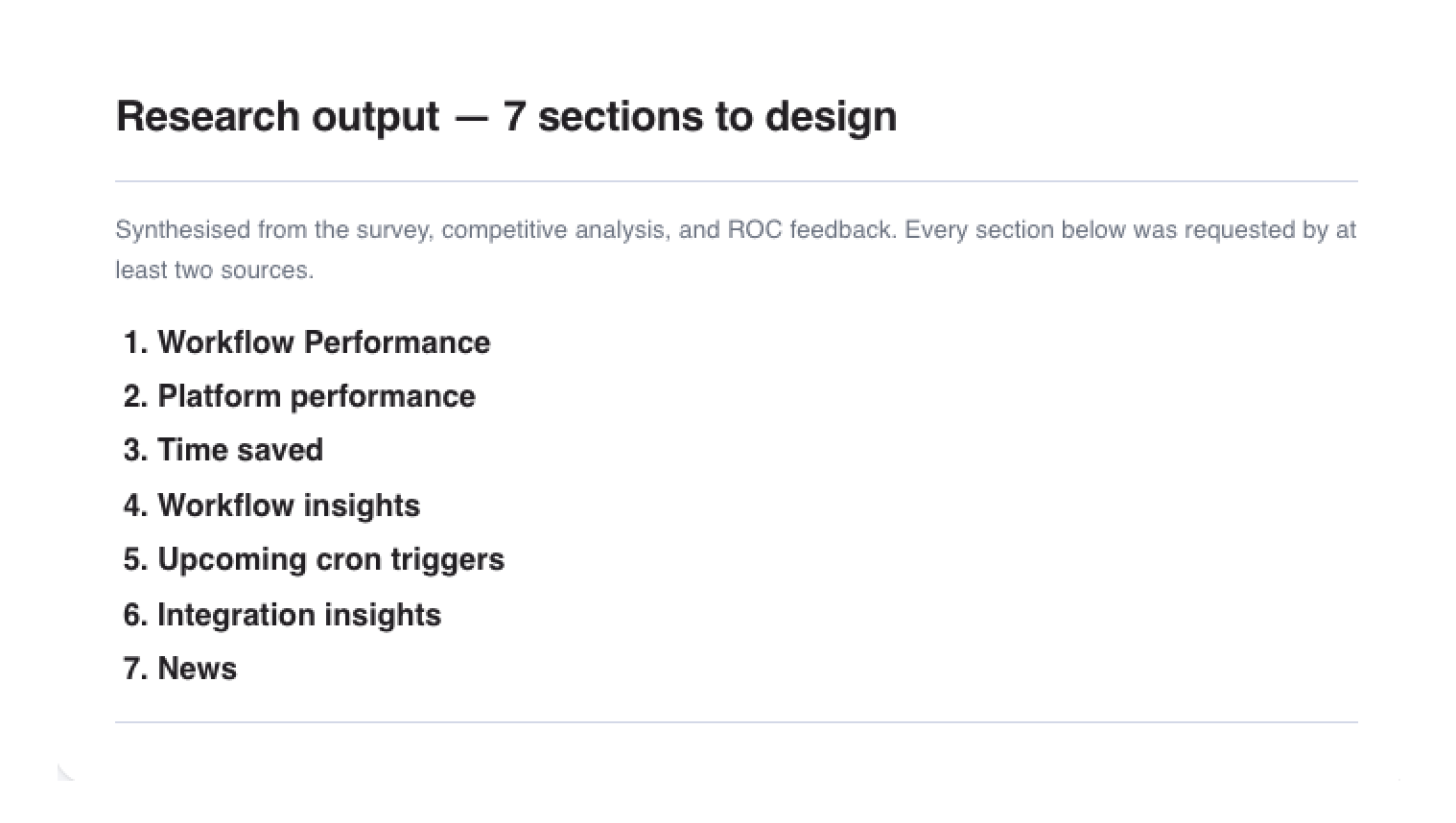
7
New data surfaces shipped
Previously invisible to users
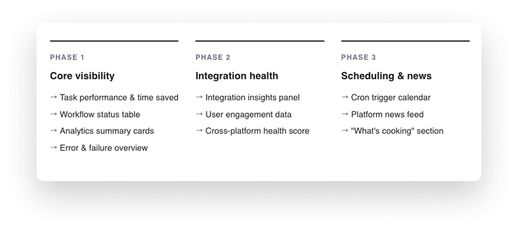
3
Phases delivered
Iterative rollout from core visibility to scheduling
Challenge
The dashboard existed. It just had nothing to say.
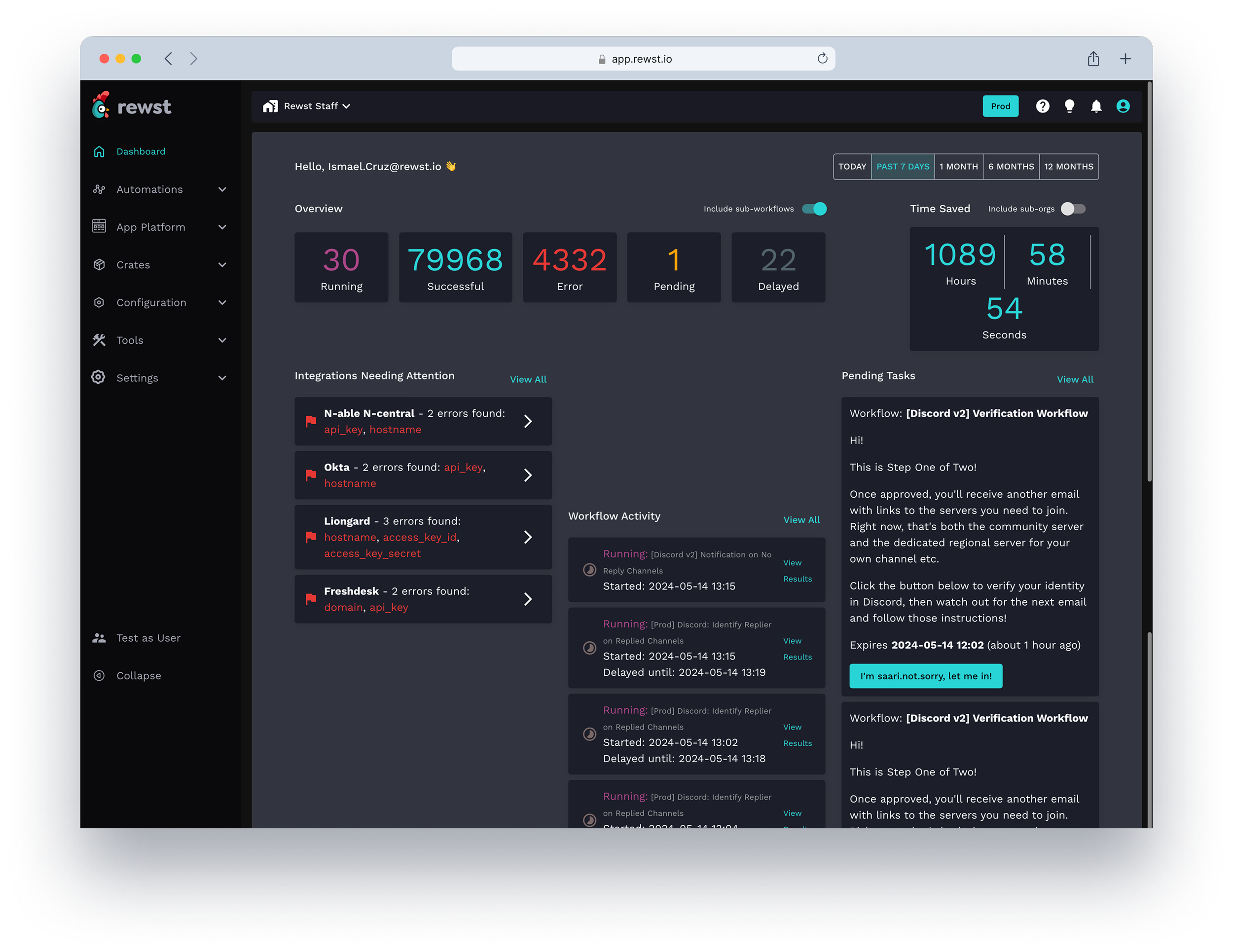
Rewst's automation platform was already in production, saving specialists hours of work every week. But the dashboard — the first screen users saw after logging in — communicated almost none of it. No usage metrics. No health indicators. No time-saved summaries. Power users had built workarounds. New users had no idea where to start.
The business problem and the user problem were the same question asked from two directions.
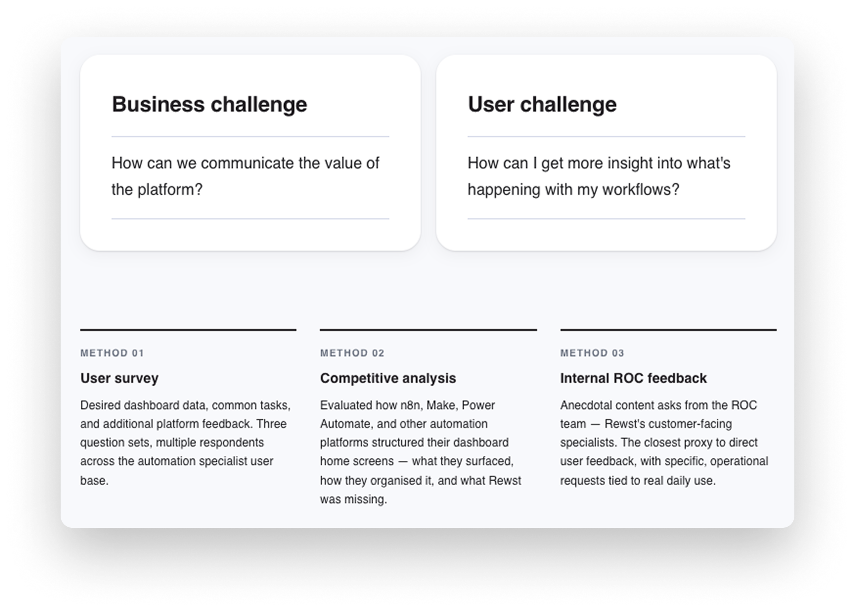
Understanding pain points
Research ran across three methods: a user survey on desired dashboard data and common tasks, a competitive analysis charting how comparable automation platforms structured their home screens, and internal anecdotal feedback collected from the ROC team — Rewst's customer-facing specialists who used the platform daily. Three themes surfaced consistently across all three sources.
01
Time-saved data was the most requested metric — and completely absent
02
Workflow management and quick access were the most common enhancement requests
03
Errors and failures surfaced too late, with no accountability trail
04
Competitors had already solved the visibility problem
Cross-functional collaboration
Scoping it down to ship it faster
I facilitated MVP scoping workshops with Product and Engineering to align on what to ship first, validate technical feasibility, and sequence the rollout. The question wasn't just what to build — it was what to hold back from Phase 1 so the first ship was actually useful rather than half-finished.
Integrations and the news feed were strong user requests, but deferring them to Phases 2 and 3 meant Phase 1 could land with a tight, trustworthy core: time saved, workflow performance, and error visibility. That sequencing decision came directly from the workshop.
Solution
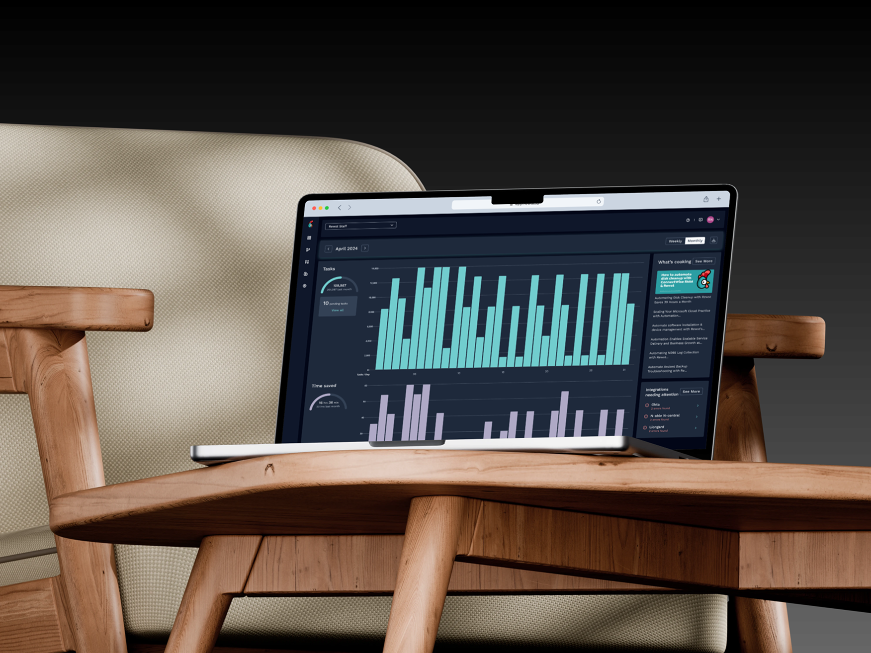
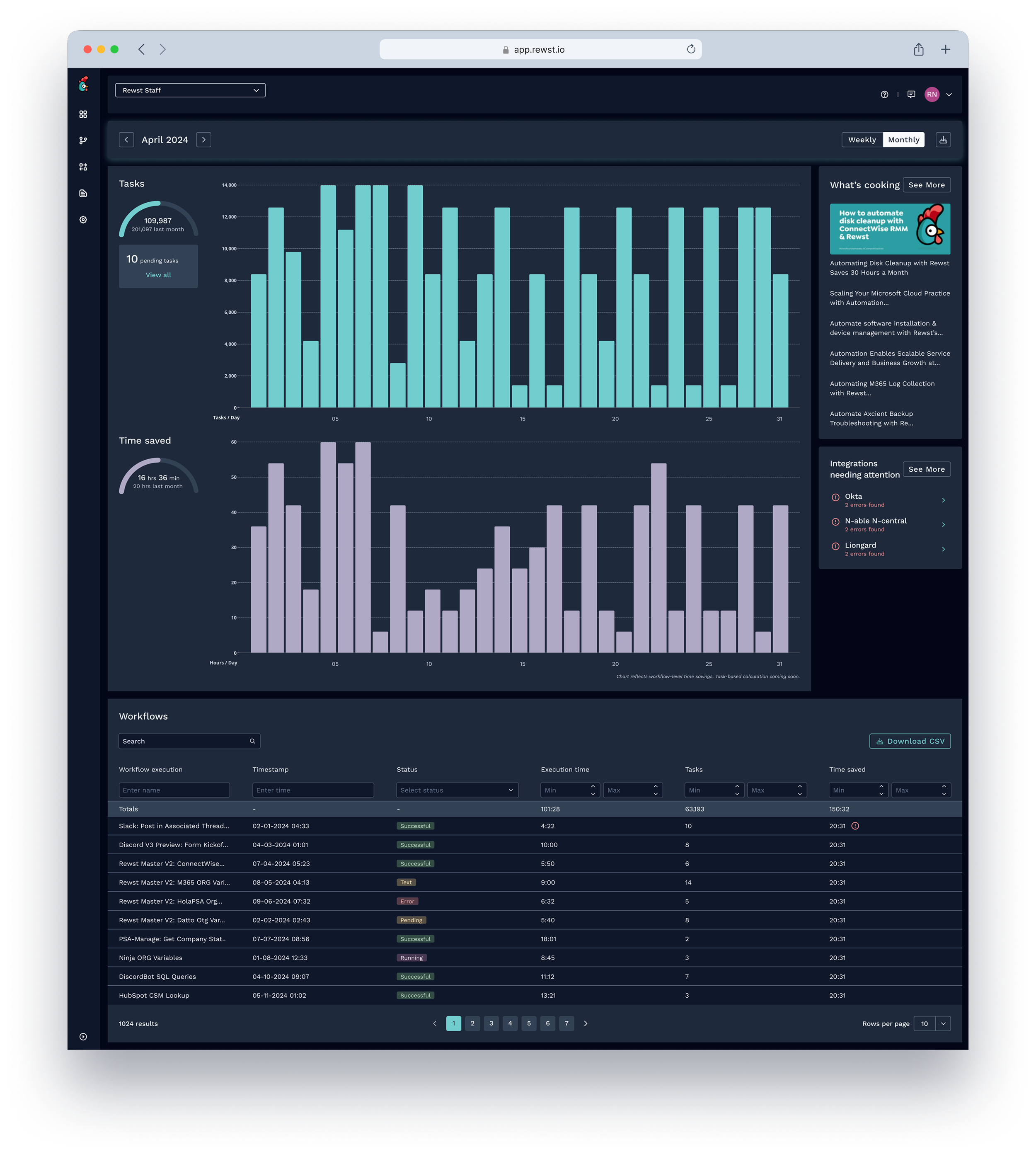
A home screen built around what users actually needed to act on.
I took a holistic approach — not starting from scratch, but systematically improving the areas causing the most friction. Rather than designing a passive report screen, the goal was an active workspace where users arrive at the start of a session and immediately know what's working, what needs attention, and how much value the platform has generated.
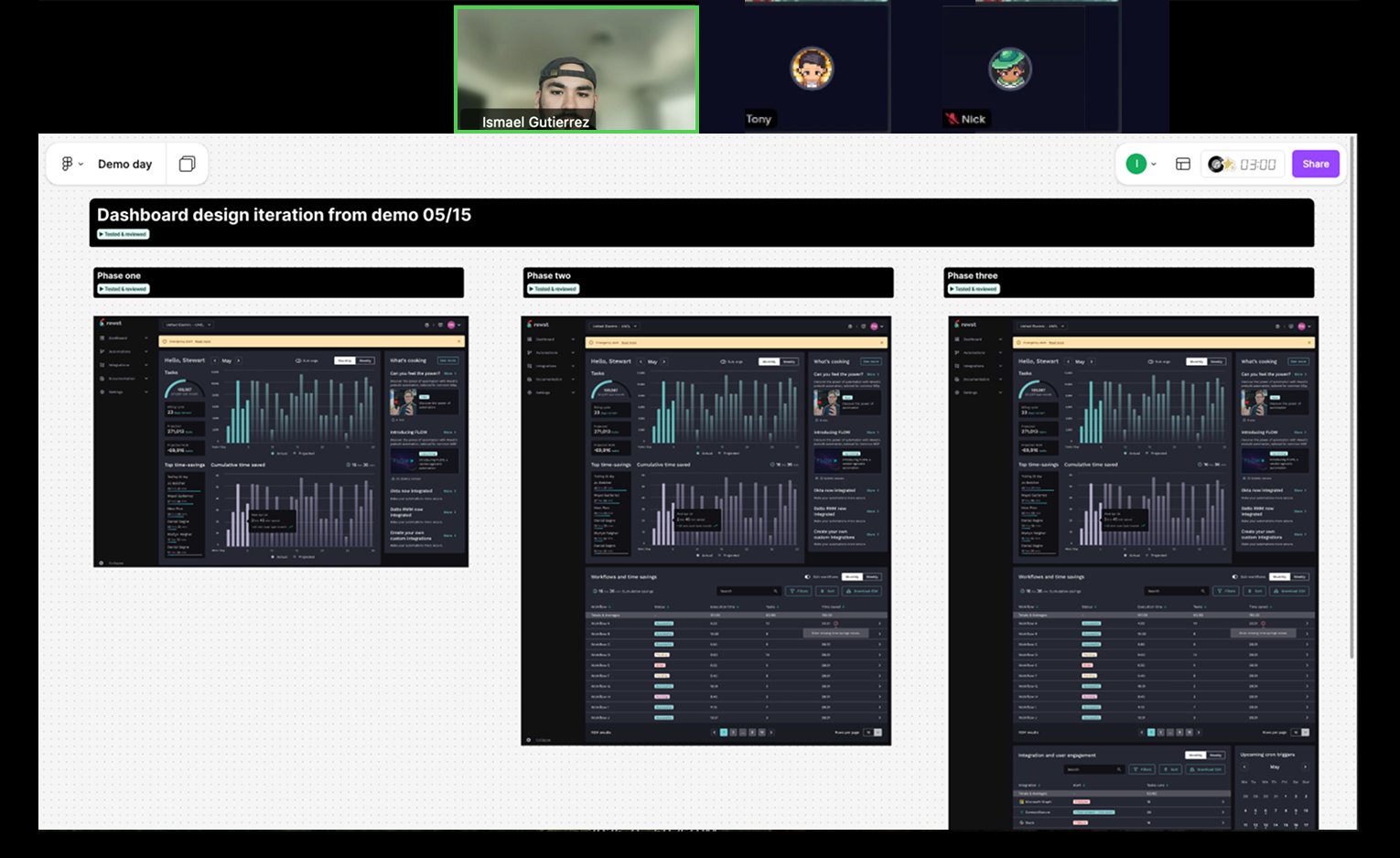
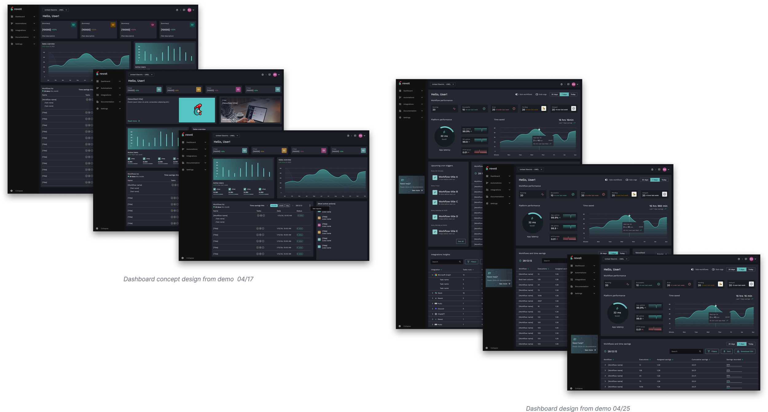
Design exploration
Between the April 17 and April 25 demos, three concept versions moved through testing and review before committing to high-fidelity. Each version changed the information hierarchy in a meaningful way.
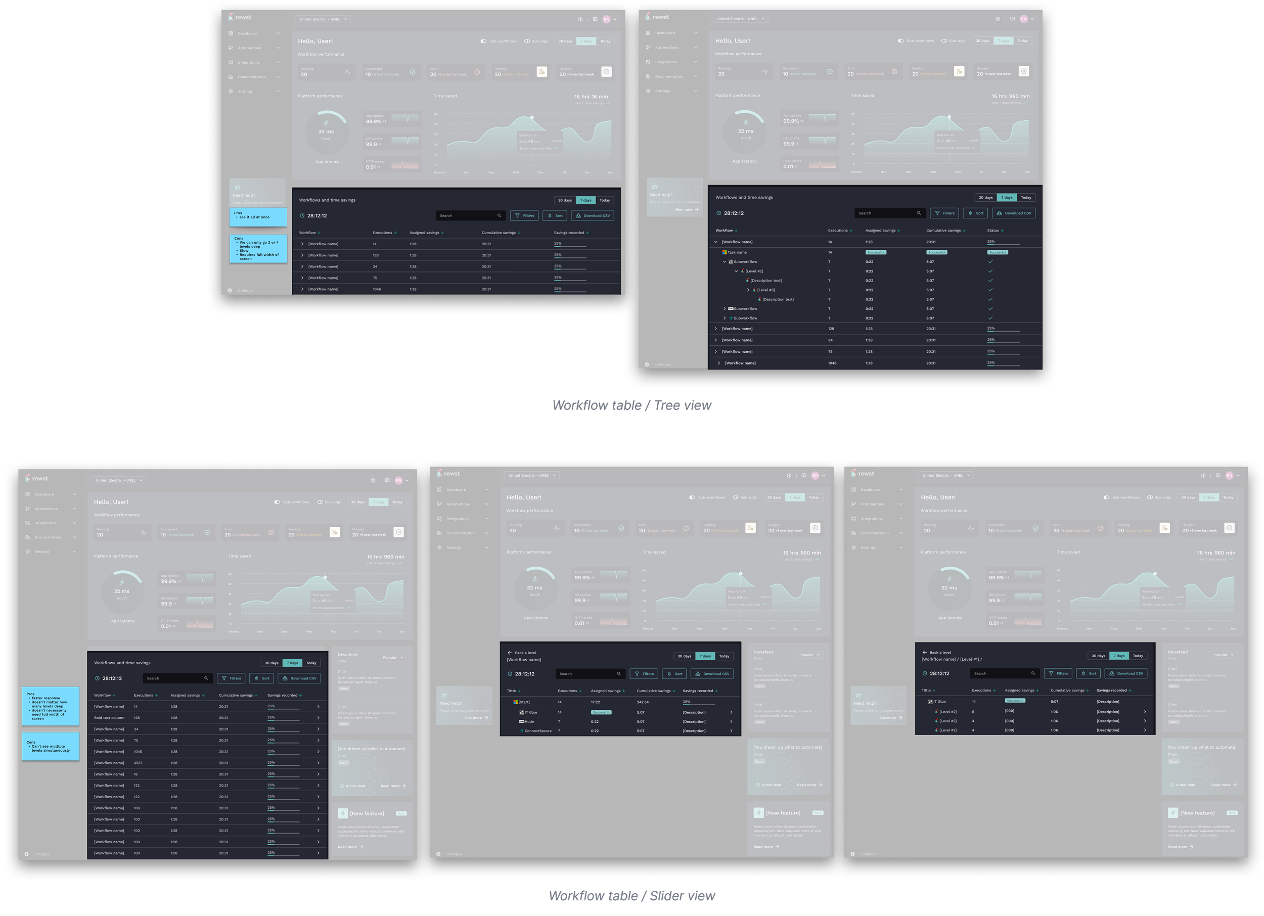
The workflow table: tree view vs. slider view
The workflow table required a separate exploration of its own. Sub-workflows mean the data is inherently nested — a flat list wouldn't show the relationships that mattered. Two patterns were built and tested.
The tree view expanded inline, letting users see the full hierarchy at once. The advantage: everything visible simultaneously. The constraints: limited to 3–4 levels deep, slow to render on complex workflows, and required the full width of the screen.
The slider view drilled into each level in a panel that slid in from the right. Faster response, no depth limit, and it didn't need full-width. The trade-off: you could only see one level at a time, losing the at-a-glance hierarchy that the tree view gave you.
The slider view shipped. The speed and depth flexibility outweighed the simultaneous-view benefit — especially given that most workflows users needed to debug were deep, not wide.
Key features
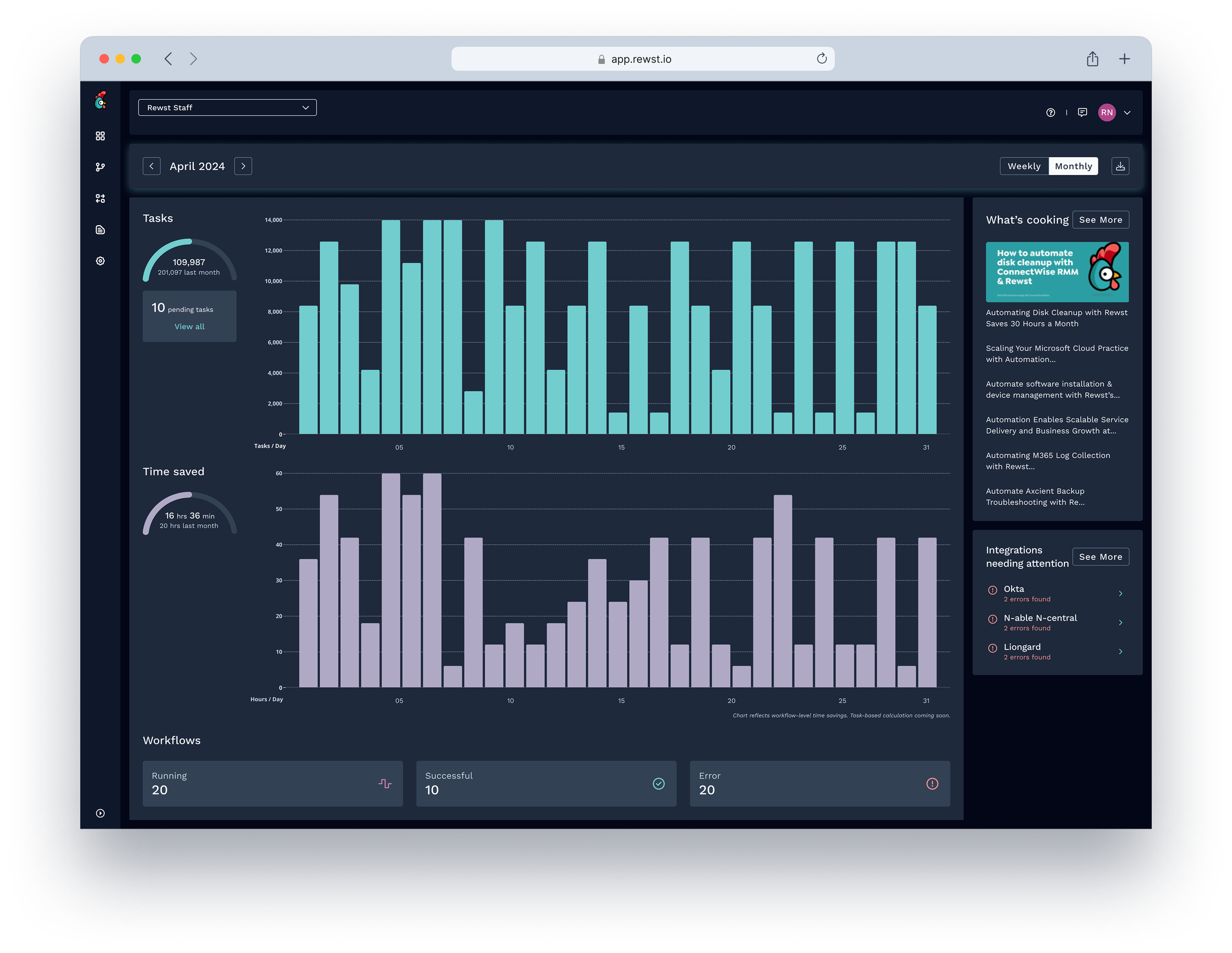
01 — Lead with time saved, not executions
Decision: The primary analytics card surfaces time saved — in hours and minutes — not raw execution counts. Adjustable by time window and filterable by org.
Rationale: Execution counts are a proxy metric. Time saved is the outcome automation specialists actually care about and the number they use to justify the platform to their stakeholders. Leading with it frames the whole dashboard around value, not activity.
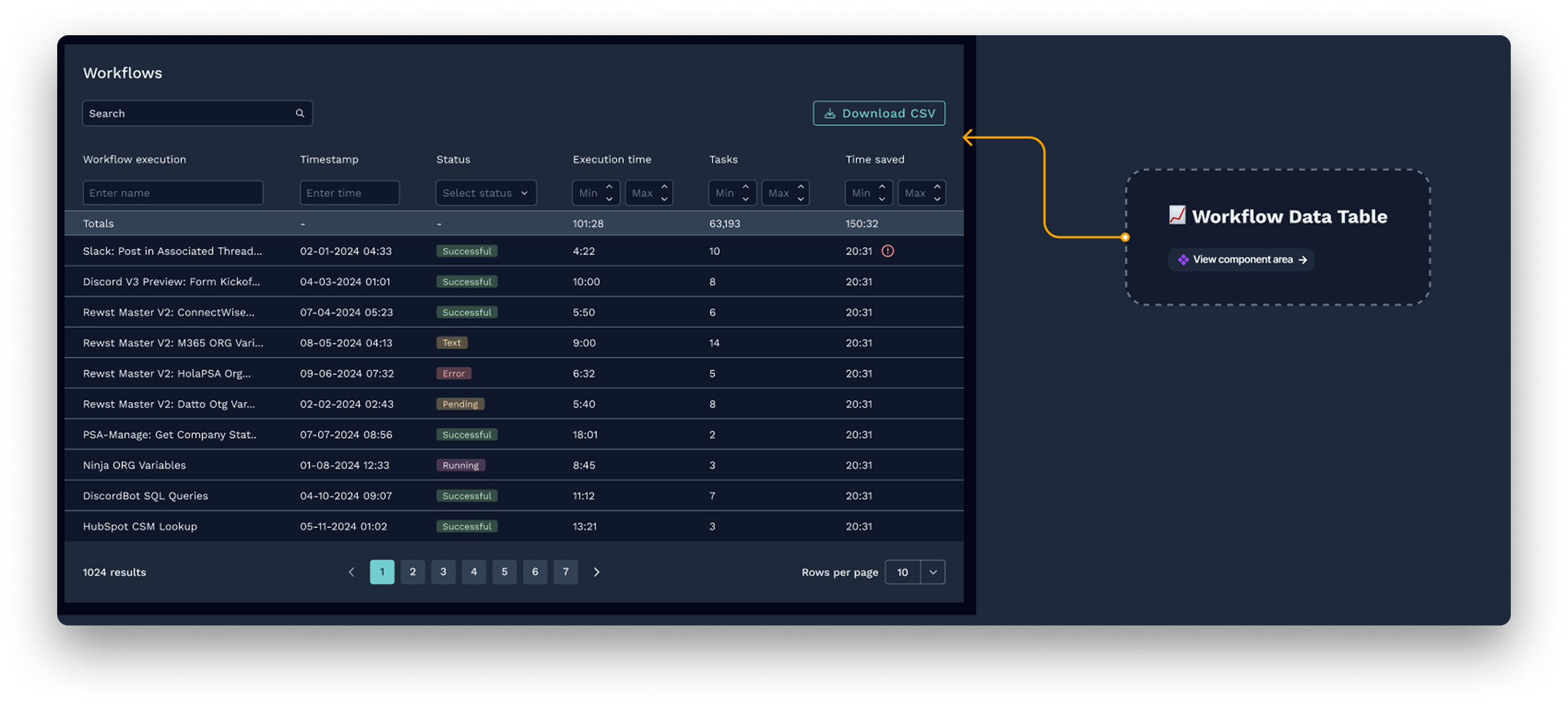
02 — Slider view over tree view for the workflow table
Decision: The workflow table uses a slider navigation pattern — drilling into sub-workflow levels sequentially in a panel — rather than an inline tree that expands all levels at once.
Rationale: The tree view had one real advantage: seeing everything simultaneously. But it could only go 3–4 levels deep, was slow to render on complex workflows, and required the full width of the screen. The slider had no depth limit, was significantly faster, and didn't force full-width layout. For users debugging deep workflows — the primary use case — speed and depth mattered more than simultaneous visibility.
03 — Integrations and cron triggers as first-class sections
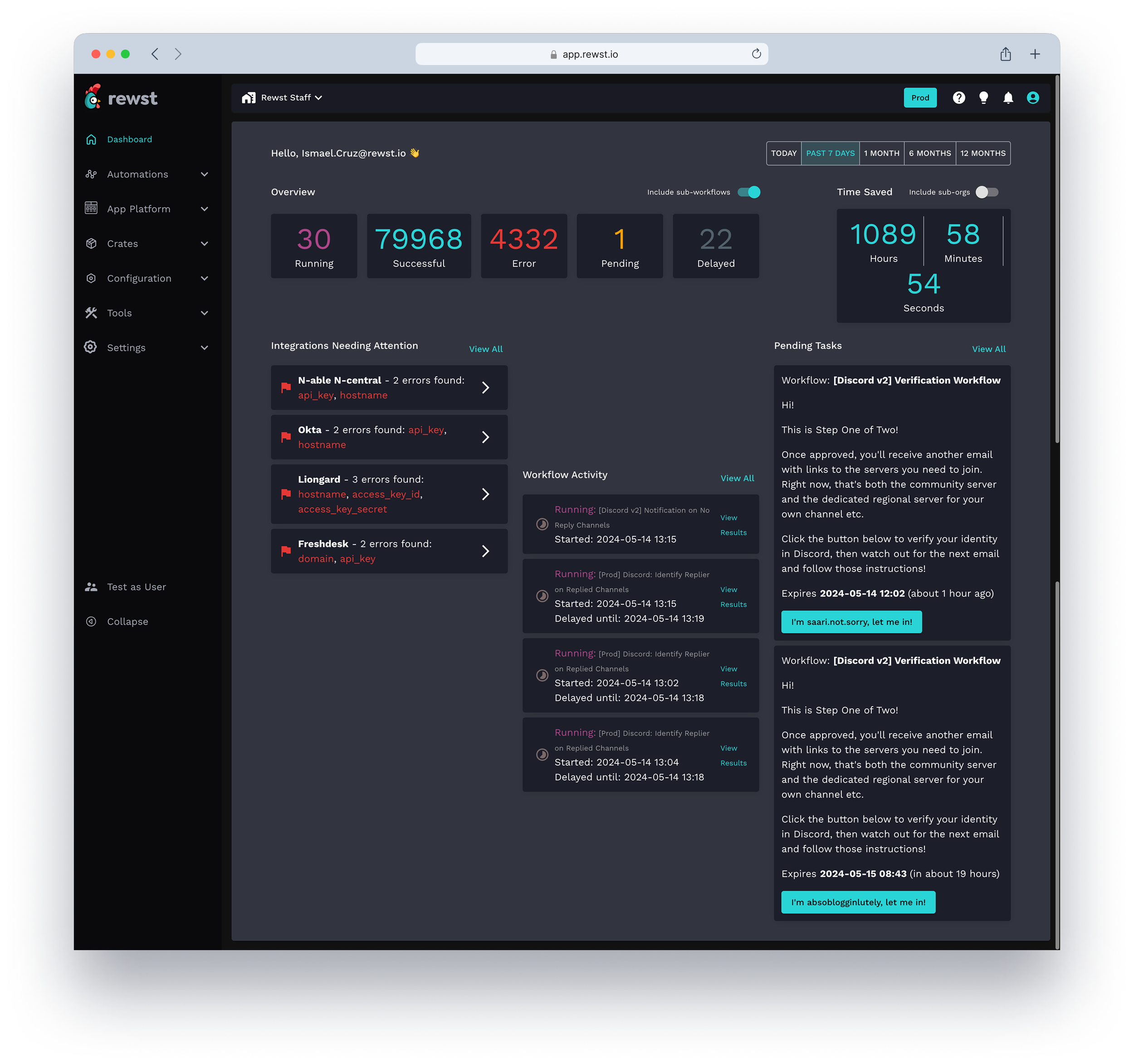
Decision: Integration health and upcoming cron triggers are surfaced as dedicated sections on the dashboard, not buried in separate settings views.
Rationale: Both were consistently cited in internal feedback as things users checked manually and repeatedly. Bringing them onto the dashboard removed a context-switching tax that accumulated across every session.
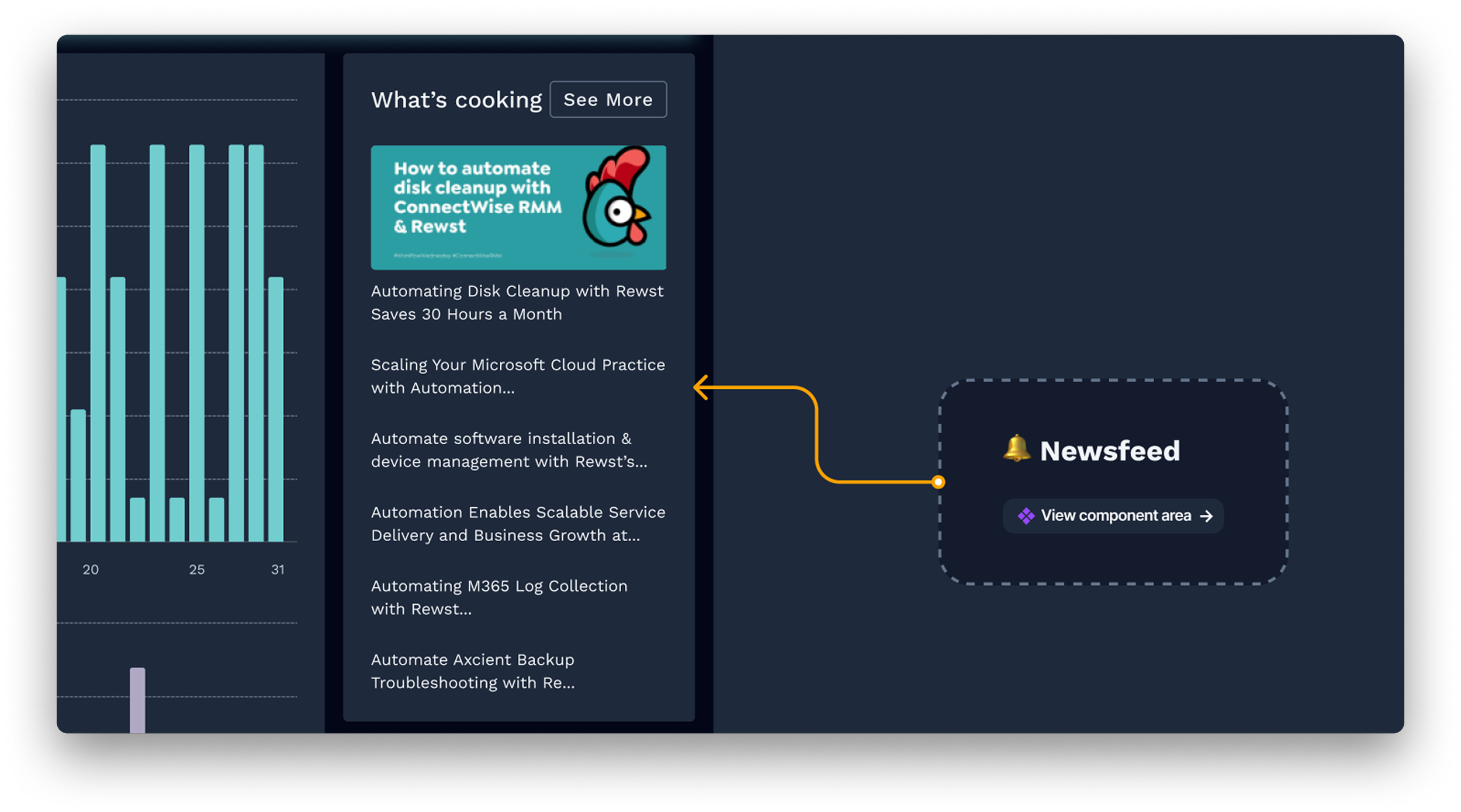
04 — A newsfeed to surface platform context inline
Decision: A "what's cooking" feed shows product updates, new integration releases, and platform news inline on the dashboard.
Rationale: Users felt disconnected from what was being built and shipped. A lightweight feed closed that gap without a separate communication channel — and gave the home screen a reason to feel alive rather than static.
A home screen that finally earned its place.
The redesigned dashboard gave Rewst's automation specialists a home screen that reflected the work they were doing and the value they were delivering. For the first time, users could open the platform and immediately answer three questions: are my workflows running correctly, how much time has the platform saved, and is there anything I need to act on right now.
The phased delivery model let us ship Phase 1 without waiting for every section to be complete. The component patterns established during this project became a foundation for other parts of the platform.
Users can now see the real value of their automation at a glance — no manual tallying required
Integration health and cron triggers removed repeated context-switching from every session
The component library built during this project accelerated design across the whole product