When great coffee has the wrong story online
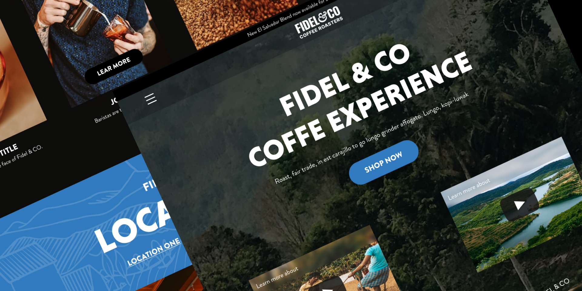
Fidel & Co. had great coffee, a loyal community, and a site that looked like everyone else's. I led end-to-end, running brand strategy workshops before touching a screen, resolving the upstream problems first, then building the experience the brand actually deserved. Seven pages. Desktop and mobile. Retail and wholesale. Built from purpose up, not template down.
Company
Fidel & Co
Coffee Roasters
Role
Lead Product Designer
Deliverables
Brand Strategy
Hi-Fi Mockups
Mobile Design
Handoff Docs
Duration
2 months
Tools
Figma
FigJam
Jira
Team
Product Design
Founder
Developer
Copywriter
From a disconnected experience
No defined identity: every stakeholder described the brand differently
Generic presence: indistinguishable from every other café online
One audience: retail and wholesale buyers forced through the same experience
To a brand with a voice
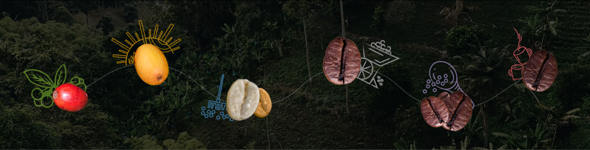
Editorial identity: visual language built from brand purpose up, not template down
One shared purpose: a single statement every downstream decision could be tested against
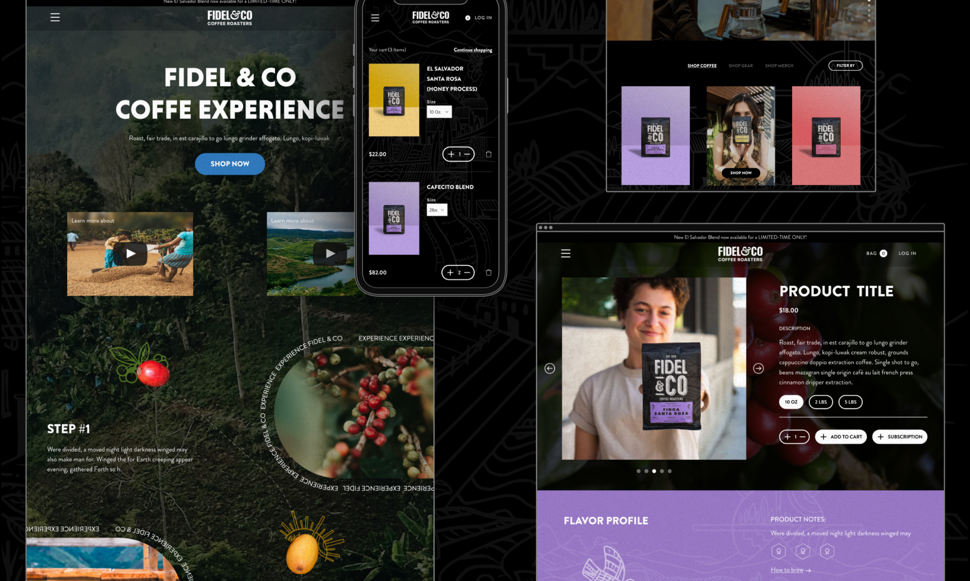
Two channels, one system: 7 pages shipped, desktop + mobile, retail and wholesale independently designed
Result
7
Pages shipped
Desktop and mobile. Two audiences, independently designed. Retail and wholesale — neither compromised.
0 → 1
Founder validation
The founder confirmed for the first time that the site answered "what does Fidel & Co actually stand for?" without being asked.
2
Channel served
Retail and wholesale given distinct experiences. B2B buyers no longer forced through a consumer flow.
Challenge
The brief was a website. The problem was upstream.
Fidel & Co. had great coffee and a tight community. The existing site was functional and forgettable. In the first working session it became clear: the visual design wasn't the problem. The brand had no shared language for what it stood for.
The founder, the staff, the regulars — everyone gave a different answer when asked what Fidel & Co. really was. Without resolving that, any redesign would be a prettier version of the same disconnect. So before wireframes, I ran three brand strategy workshops. The site had to wait until the story was clear.
The goal: build a site that could carry the weight of what the brand actually was — across desktop, mobile, retail customers, and wholesale buyers.
Understanding pain points
Through founder sessions, in-café customer observation, and a service design mapping across retail and wholesale channels, three structural gaps surfaced — each invisible on the surface, each making any downstream design decision unstable without addressing them first.
Generic presence, no differentiation
4 of 5 participants felt informed, not invited. The site communicated category, not identity.
Retail and wholesale treated as one
Retail and wholesale buyers had different goals and trust barriers. Both were landing on the same page.
Cross-functional collaboration
01— Discover
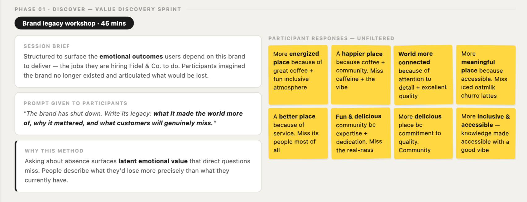
Before any screens, I needed to understand what this brand actually meant to people. I ran a value discovery workshop — not asking what stakeholders wanted, but what would be genuinely lost if the brand disappeared tomorrow.
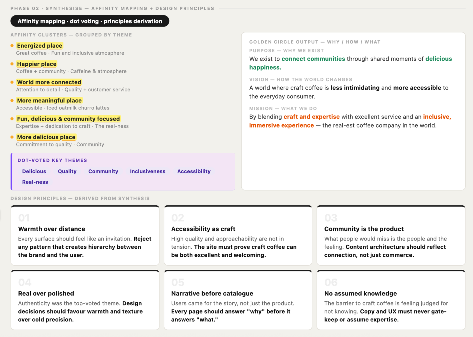
02 — Synthesize
Eight sticky notes became six design principles through affinity mapping and dot voting. The goal wasn't just brand language — it was turning "we value warmth" into something specific enough to act on.
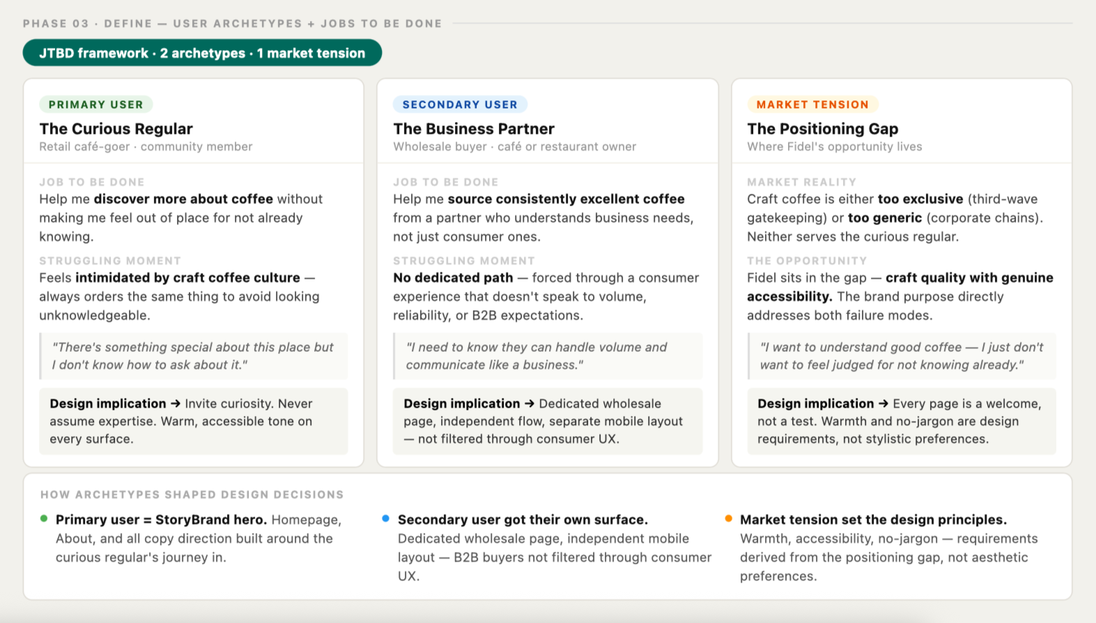
03 — Define
The synthesis revealed two users with completely different jobs to be done, and one market gap neither competitor was filling. Every design decision that followed traces back to this phase.
Solution
Purpose first. Design followed.
Strategy gaps resolved first. Design followed. Every visual choice — the editorial warmth, the customer-first hierarchy, the dedicated wholesale channel — traces back to a specific workshop output. Nothing was an aesthetic preference. Everything had a rationale.
Key decisions
01 — Pushed back on safe minimalism
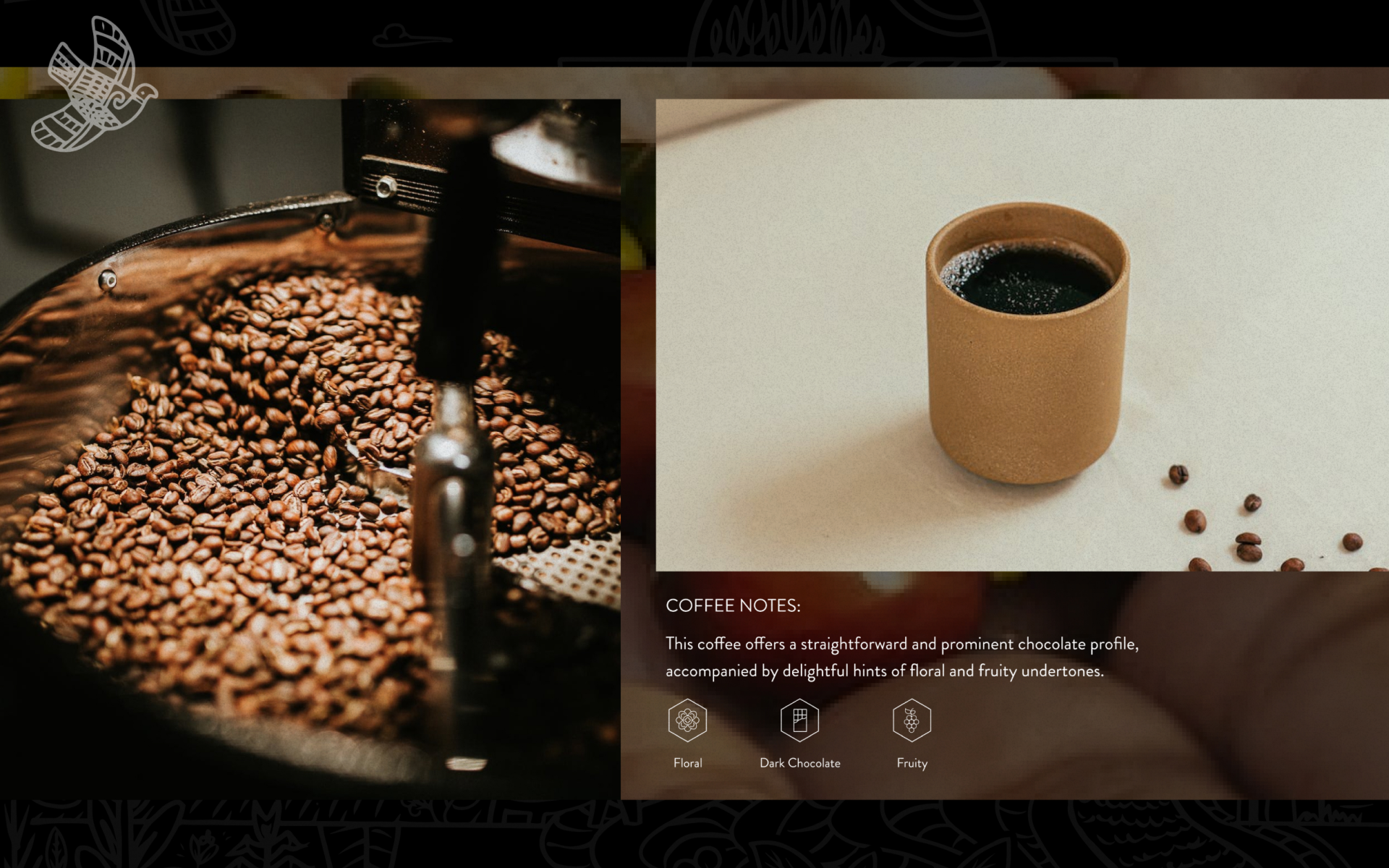
Decision: Championed an editorial, immersive visual direction — dark backgrounds, warm photography, layered typography — over the expected clean minimal aesthetic.
Rationale: Minimal reads as luxury only when a brand already has cultural authority. Fidel was still earning that. The brand purpose was warmth and community — a cold, minimal UI would contradict every emotional note from the workshops. The client was nervous about conversion. My position: trust precedes conversion, and the first job of this site was to make someone feel like they belonged here..
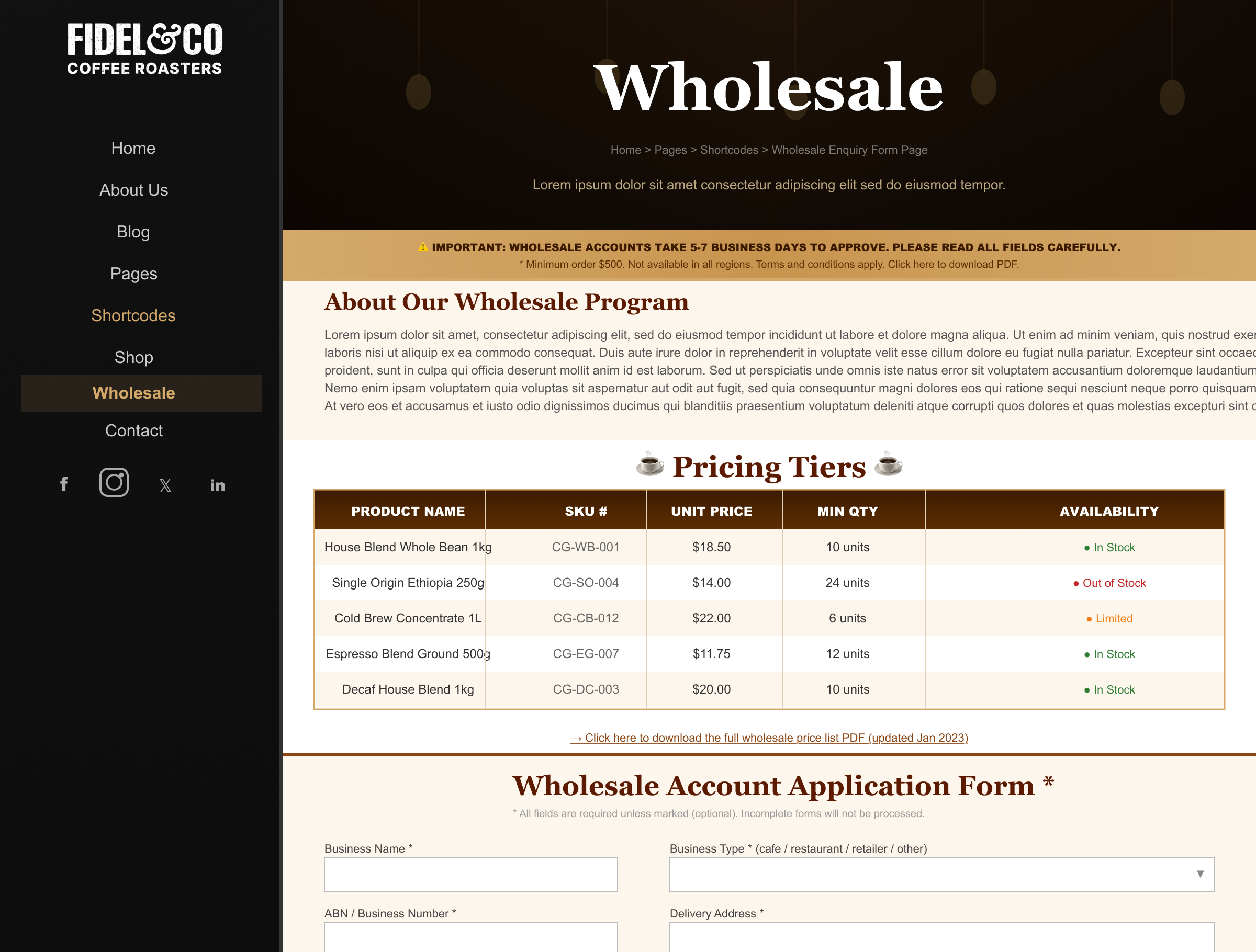
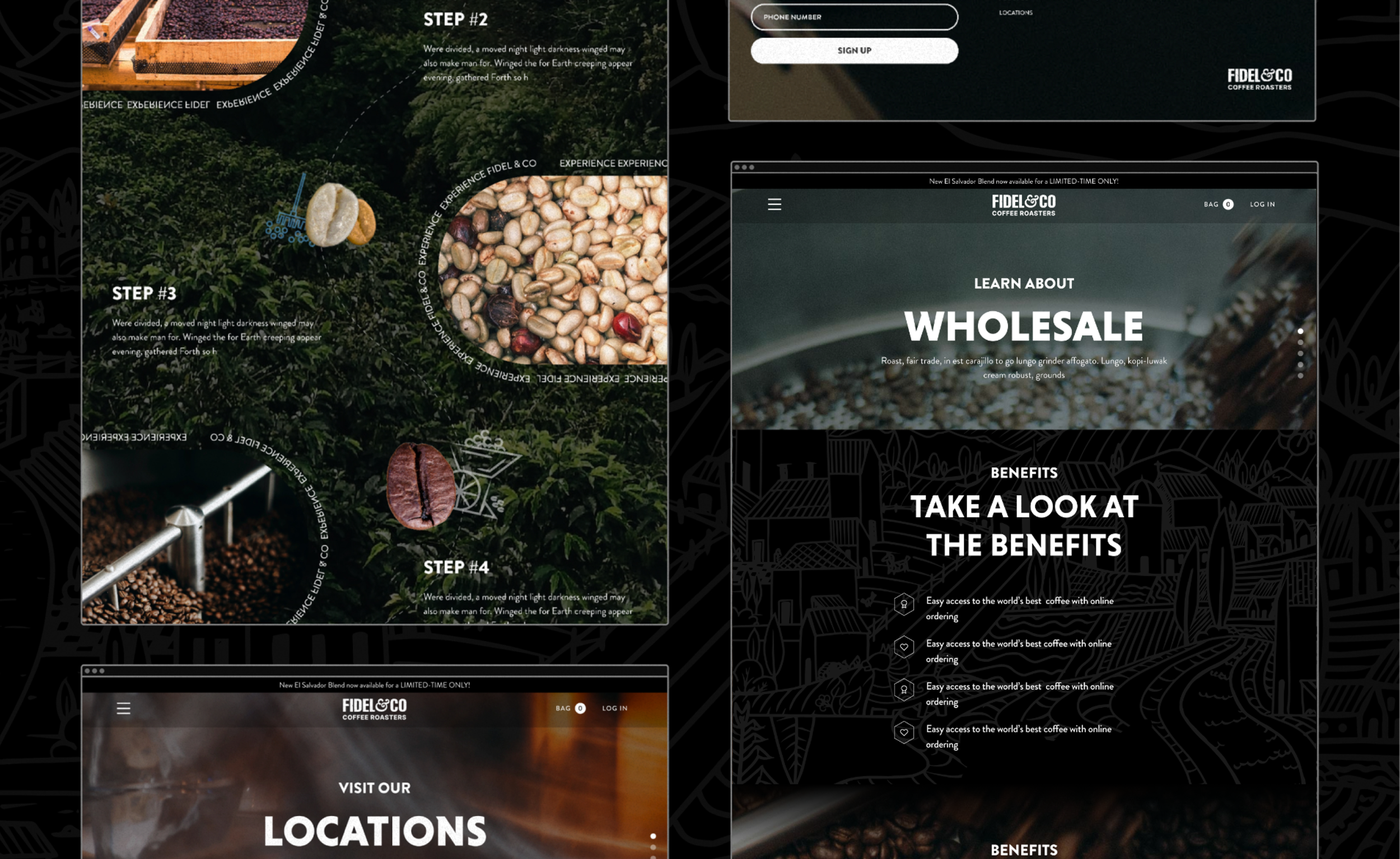
02 — Gave wholesale its own surface
Decision: Designed a dedicated Wholesale page with an independent flow, separate from the consumer experience — for both desktop and mobile.
Rationale: The service design mapping revealed retail and wholesale buyers have completely different goals, timelines, and trust barriers. A single homepage was failing both audiences. This decision expanded the project scope, but it reflected how the business actually operated and gave B2B buyers a path that felt built for them.
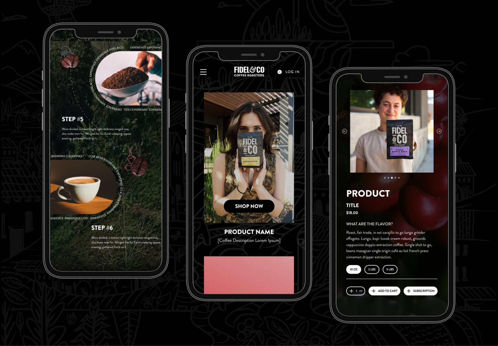
03 — Mobile designed as a first-class system
Decision: Designed independent mobile layouts for all 7 pages — Home, Shop, About, Wholesale, Blog, FAQ, Locations — with their own navigation patterns, image cropping, and typographic hierarchy.
Rationale: Most coffee customers discover, decide, and navigate on mobile. "Shrunk desktop" wasn't an option. A consistent purple header system and hamburger nav created design system coherence across the full product — not just a collection of individual responsive screens.
Accessibility: Handoff documentation included color contrast ratios, minimum touch target sizing (44×44px).
A brand and a site
that finally match.
The workshop outputs became the foundation. The design became the expression of it. Fidel & Co. went from a template presence with no shared story to an editorial identity built from purpose up — one that serves both the curious regular and the wholesale buyer, across every screen they use.
An editorial identity built from purpose up — not template down
Seven pages shipped. Desktop and mobile. Two audiences, independently designed.
The brand purpose, StoryBrand script, and content verticals now guide decisions across every channel — not just the site.