B generous's end-to-end giving platform
B Generous came to Few with a brief that had never been done before: design the world's first philanthropic "Donate Now, Pay Later" platform. A regulated financial product with four parties in every transaction. It had to feel as easy as sending a text.
Company
B Generous
Deliverables
User Research
Competitive Analysis
User Journey Maps
Wireframes & Prototypes
Final UI & Brand Identity
Duration
12 months
Tools
Figma
Miro
Jira
UserTesting.com
Team
Product Design
Engineering
Legal & Compliance
Role
Lead Product Designer

From a broken giving moment
No deferred option: Donors could only give what they had on hand, right now
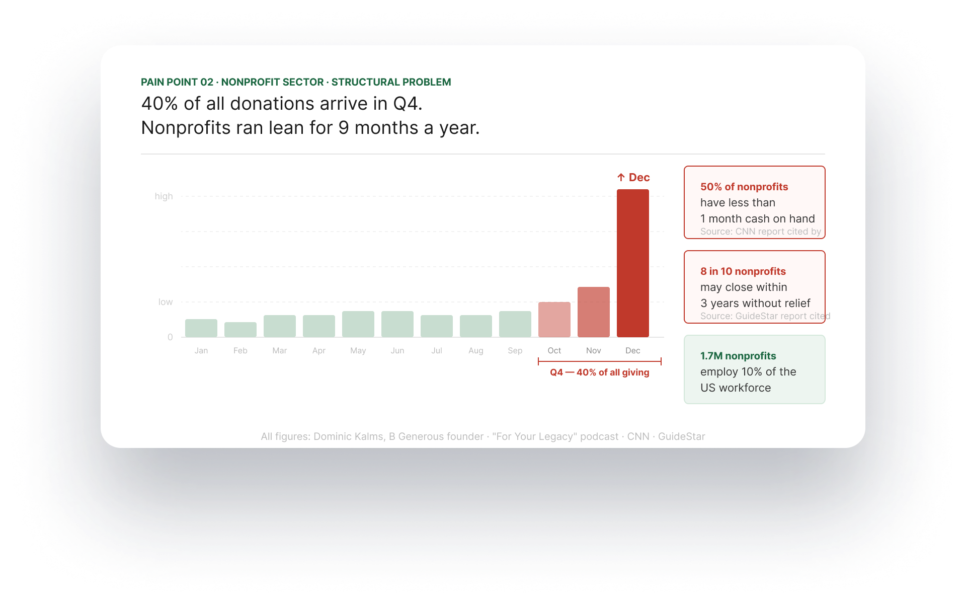
Nonprofit cash gaps: 40% of all donations land in Q4, leaving nonprofits cash-starved year-round
Unmet generosity: 66% of donors wanted to give more but couldn't
To a platform that unlocks giving
Donate now, pay later: nonprofit gets paid in full on day one
Donor pays over 3, 6, or 9 months: interest-free, no fees
Both sides win: cash flow for nonprofits, flexibility for donors
Result
$250K
Donation facilitated
First 90 days post-launch
$1M
Interest free
credit extended
Q1 2024 · B Generous internal data
80+
Nonprofit partners
at launch
PETA · CORE Response · Green Bronx Machine..
3.5x
Average donation value
$128→$470.67 per donation via DNPL
Challenge
Designing a lending product that couldn't feel like one
Few was engaged by B Generous to design the entire product from scratch. No prior designs, no design system, no playbook for philanthropic lending. I led end-to-end: research, UX, UI, brand, and engineering handoff.
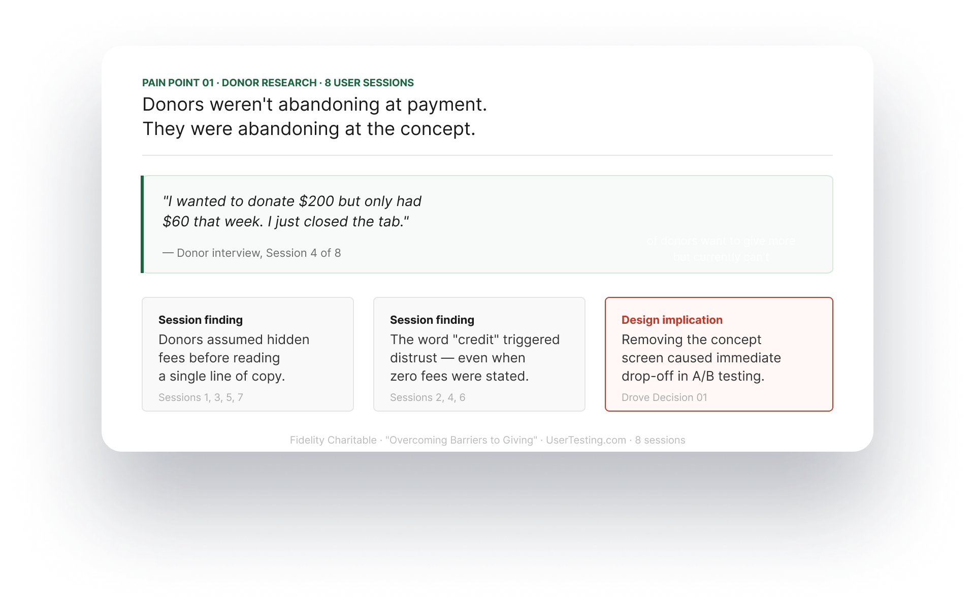
BNPL in e-commerce is invisible. You just see "pay in 4." In philanthropy, the concept isthe product. Donors had to understand and trust something that had never existed before. Without upfront clarity, research showed they assumed it was a scam and left immediately.
This was also a regulated lending product. Every design decision touched a legal constraint: federal age requirements, state-by-state licensing, mandatory disclosures. Legal was in the room from sprint 1. Compliance was designed in, not retrofitted.
Understanding paint points
Through 8 donor interviews, focus groups, and a Fidelity Charitable study, we identified two distinct problems — one on the donor side, one on the nonprofit side — that shaped every design decision.
The donor Trust barrier
Donors weren't abandoning at the payment stage. They were abandoning at the concept stage, before entering a single digit
The nonprofit liquidity crisis
Nonprofits, meanwhile, were cash-starved for nine months a year. The BNPL model solved both: donors pay over time, nonprofits get paid immediately.
One product. Two users. Designed together.
From day one this was a two-sided platform. Every donor decision was simultaneously a nonprofit decision. We designed both surfaces in parallel so nothing was added after the fact.

Approach
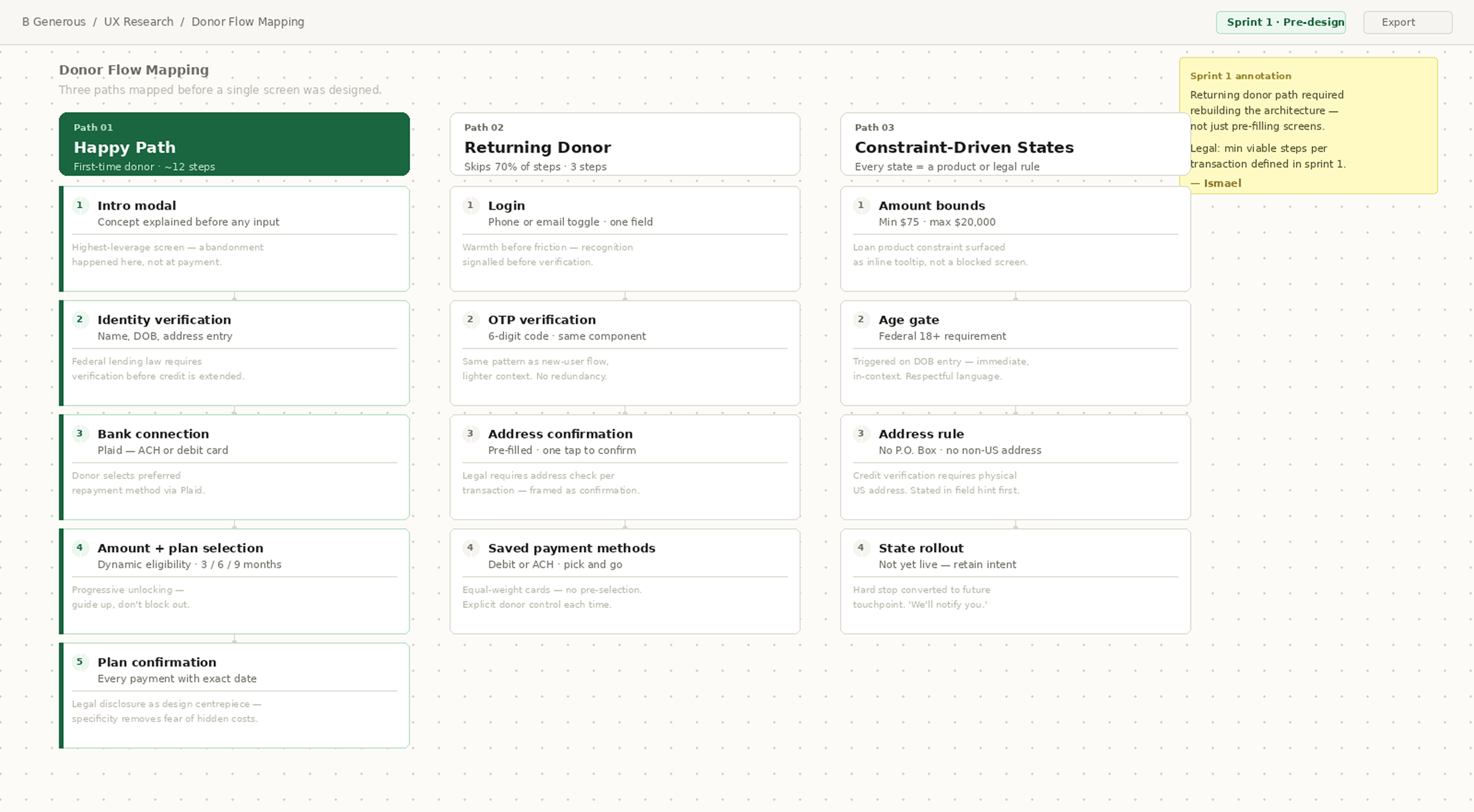
Three donor paths, designed as complete systems
Before a single screen, we mapped the full experience across every donor type. Three paths, each built as an independent system. Not variants of the same screens.
Donor flow — key decisions
The full flow is best experienced directly. Three decisions shaped the entire interaction:
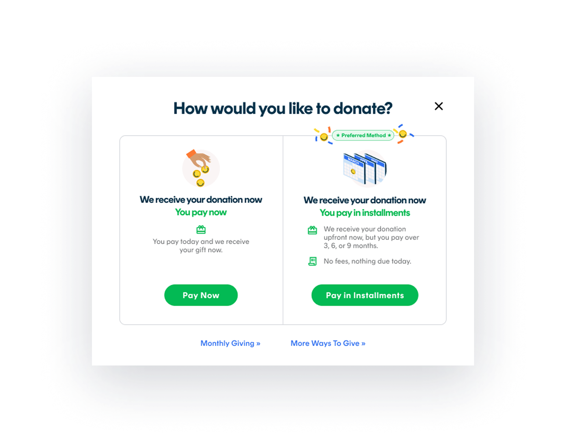
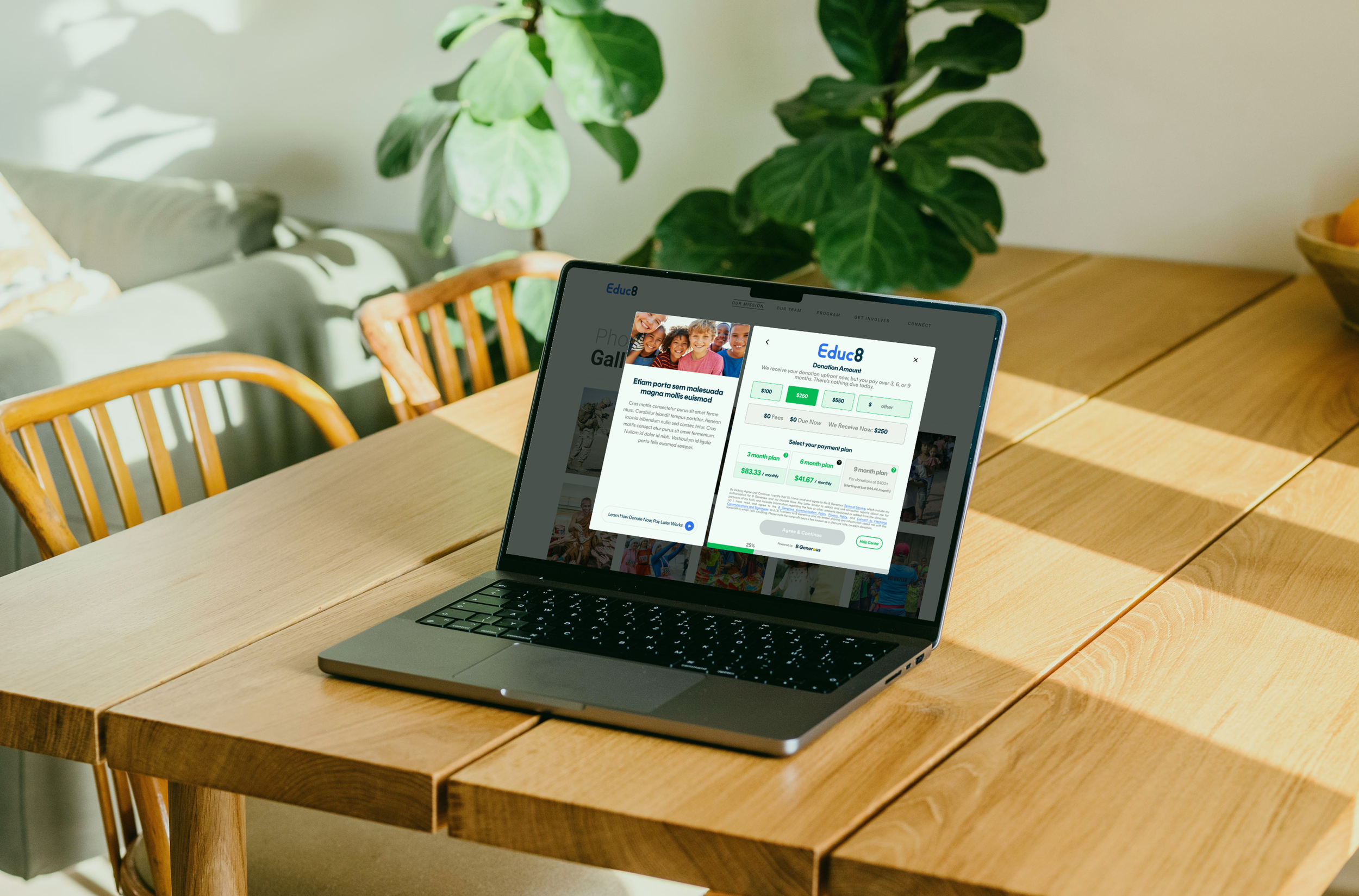
01 — Sell the concept before asking for anything:
Research showed abandonment at the concept stage, not the payment stage. The intro screen had one job: explain BNPL giving in under 10 seconds. Removing it in testing caused an immediate drop-off spike.
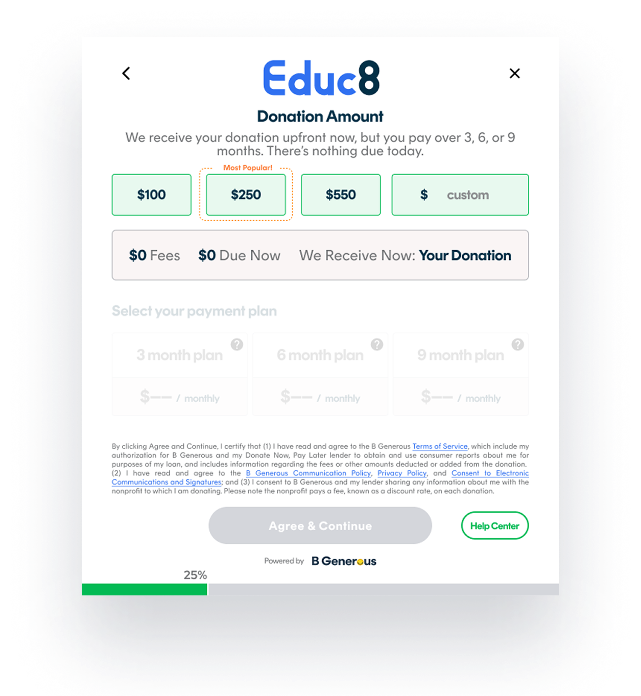
02 — Guide up, don't block out
Locked plan tiers show a threshold: "For donations of $150+" rather than an error. Donors who saw the threshold naturally considered giving more. A lending constraint became a conversion driver.
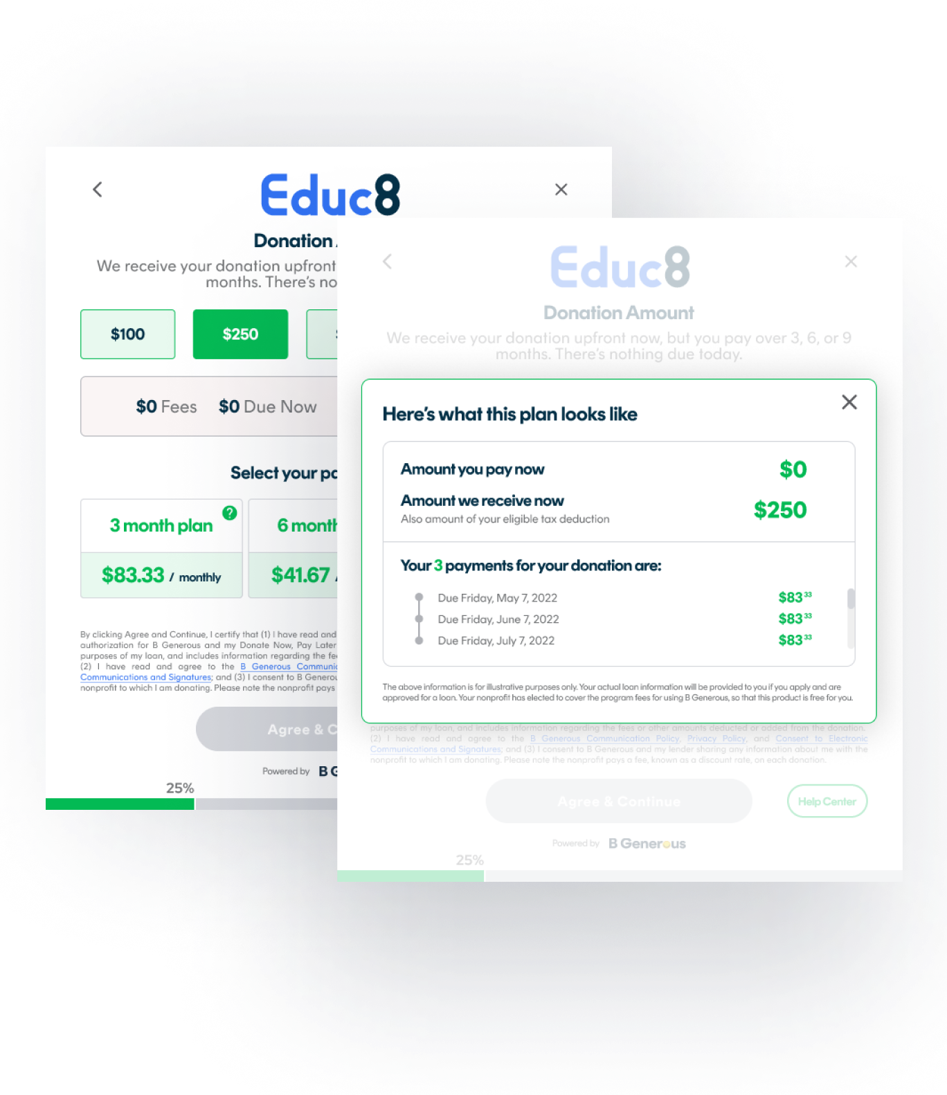
03 — The legal requirement became the centrepiece
Legal required full payment disclosure before completion. Rather than an accordion, we made it the hero. Every installment with its exact date. Donors feared surprise charges, not the commitment. Specificity removed that fear.
Nonprofit admin: the other side of every decision
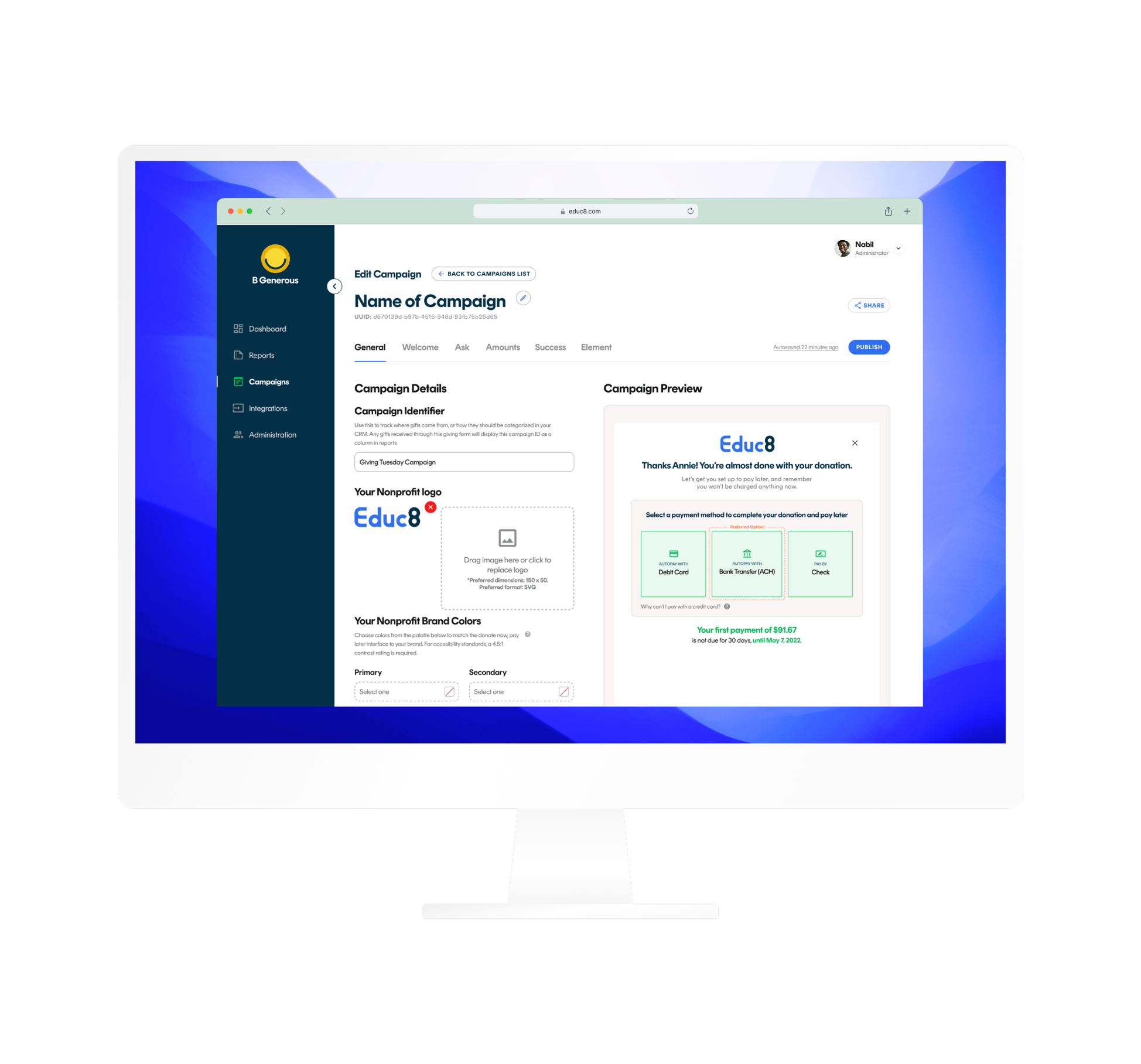
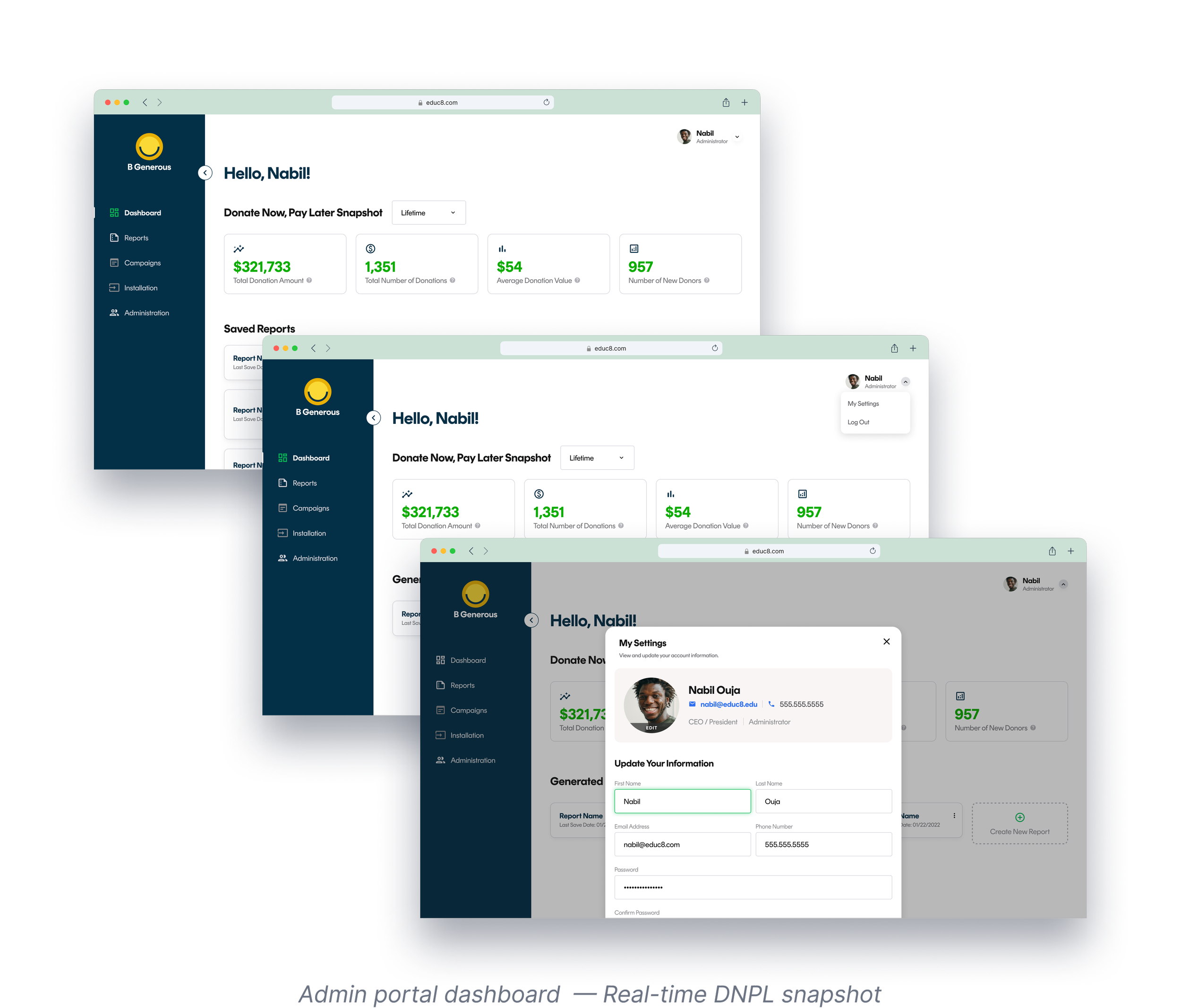
The donor flow didn't exist in isolation. Every choice in the donor flow had to work for two users simultaneously: the donor experiencing it and the nonprofit admin who set it up.
The campaign editor shows a live preview of the exact donor widget as the nonprofit configures it. The split-screen layout was itself a design decision. It made the relationship between admin choices and donor experience impossible to misread.
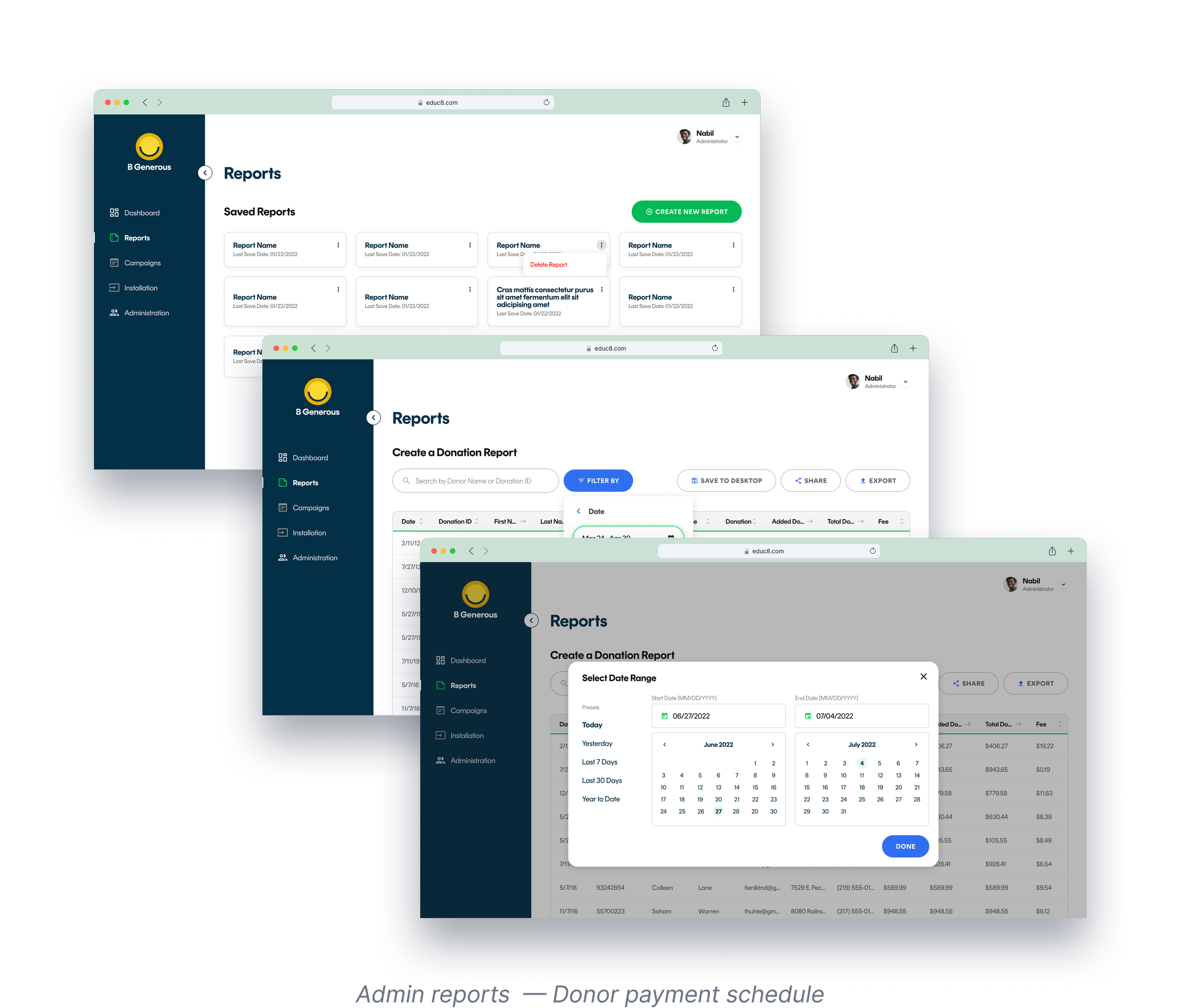
The reports table shows each donor's exact payment dates. That's the same data donors commit to in the confirmation screen, designed together so nothing was added after the fact.t.
What shipped. What it delivered.
Launched to pilot nonprofit partners including PETA, CORE Response, and Green Bronx Machine then rolled out broadly to 80+ organizations within the first 90 days.
The product worked: donors didn't just convert, they gave dramatically more. Green Bronx Machine's average donation went from $26 to most donors doubling their gift.
Across the platform, the average donation was 3.5x higher than traditional online giving.