B Generous's End-to-End Giving Platform
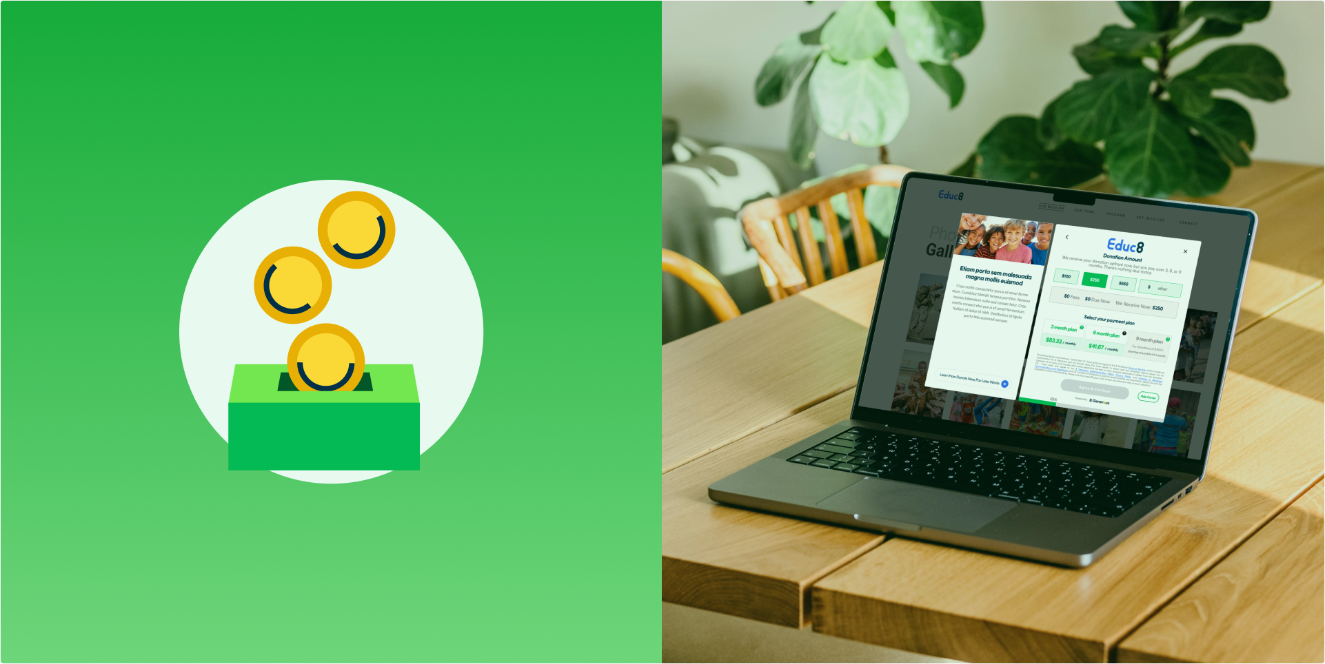
For donors, the biggest barrier to giving isn't willingness. It's immediacy. We designed B Generous, a "Donate Now, Pay Later" platform that makes charitable giving accessible without the pressure of upfront payment, serving both individual donors and non-profit organizations.
Role
Lead Product Designer
Deliverables
User Research
Competitive Analysis
User Journey Maps
Wireframes & Prototypes
Final UI & Brand Identity
Duration
12 months
Tools
Figma
Miro
Jira
UserTesting.com
Team
Product Design
Engineering
Legal & Compliance

Challenge
Our primary task was to develop an intuitive and secure experience for two distinct user groups: donors and non-profits. The goal was clear: design a platform that makes giving feel safe, flexible, and frictionless, without compromising on financial security or regulatory compliance.
Ensuring we met all legal requirements demanded close collaboration with legal advisors, front and back-end engineers, and compliance stakeholders, all while keeping the user experience at the center of every decision.
Analyzing User Needs
We began by mapping the donation journey from both sides of the platform. Research revealed that first-time donors frequently abandoned giving flows due to financial uncertainty, while non-profits struggled with unpredictable payment timelines. By conducting user interviews and journey mapping sessions, we identified the key friction points for each group. This allowed us to prioritize features that addressed real barriers, not assumed ones, and to design separate but cohesive experiences for each user type.
The Approach
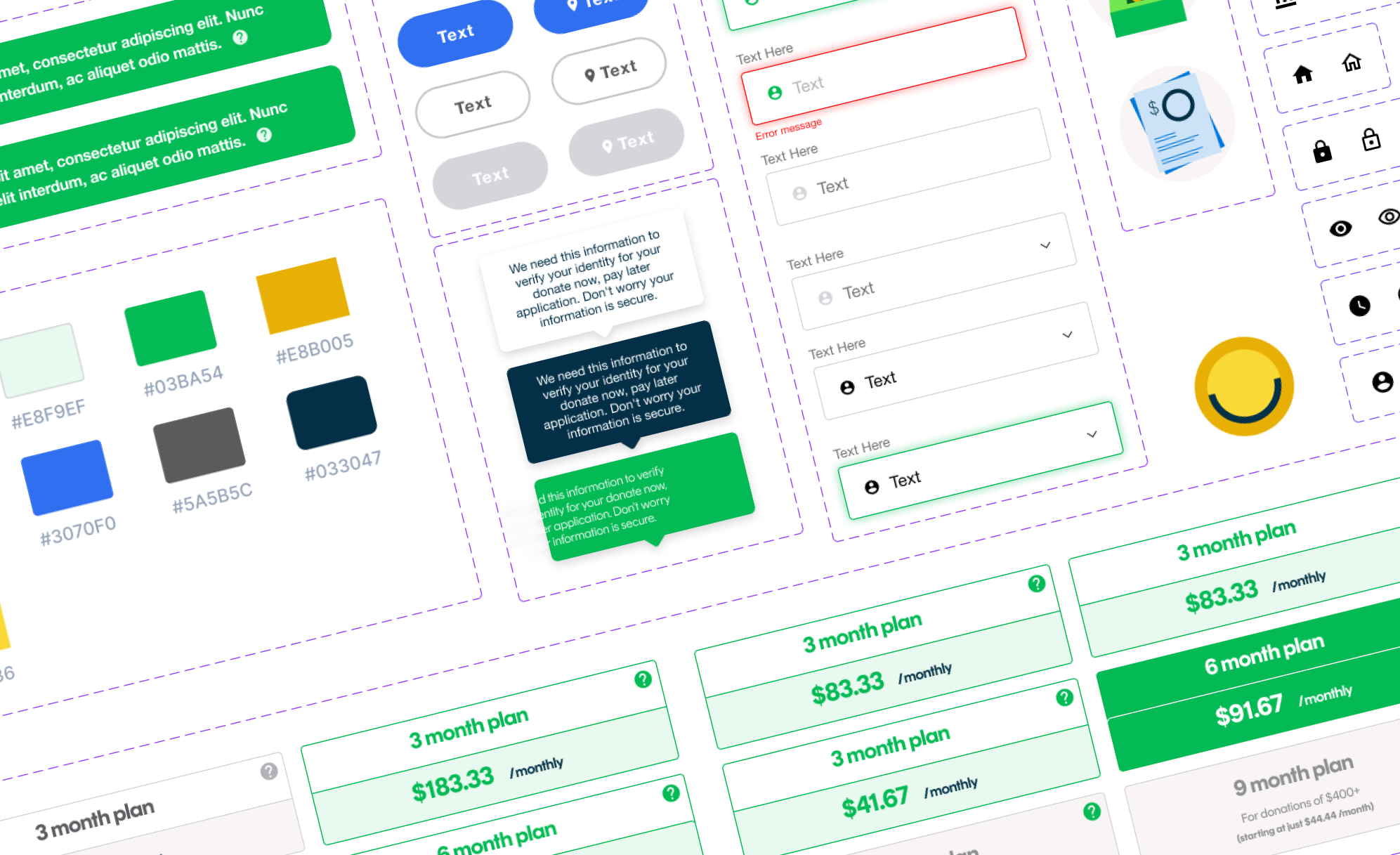
I led the UX research, UI design, branding, and prototyping for B Generous, working in close collaboration with legal advisors and the engineering team. This project required balancing complex financial product constraints with a brand identity that needed to feel human, generous, and accessible. We ran multiple rounds of usability testing to validate flows before handing off final specs, ensuring the product was both technically sound and intuitive for users of all backgrounds.
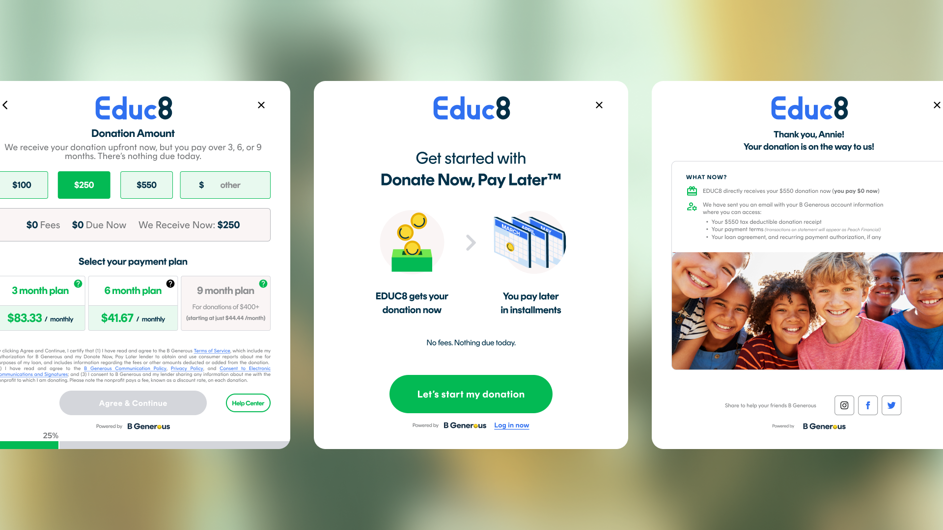
A Deferred Donation Flow Built on Trust
Our final solution centered on a streamlined donation flow that made payment deferral feel transparent and reassuring rather than ambiguous. Security measures, including two-factor authentication, encrypted transactions, and clear payment scheduling, were embedded naturally into the experience as trust signals, not surfaced as legal disclaimers.
This approach struck the right balance between protecting users and maintaining the warmth and simplicity the product needed to encourage giving.
Core Principles
We anchored the design on three core principles: transparency, accessibility, and emotional resonance. Donors needed to feel confident that their commitment was manageable and clearly communicated. Non-profits needed assurance that incoming funds were reliable and trackable.
The visual identity, built on warm tones, approachable typography, and a tone of voice that celebrated generosity without pressure, brought these principles to life across every touchpoint. After launch, users praised the app's simplicity and convenience, and the platform saw a notable increase in donations from first-time givers.