Redesigning the main side navigation
Rewst's left-hand nav had grown organically, accumulating flat hierarchies, staff-only tools, and structures that no longer matched how users worked. I led the redesign end to end: from Pendo data and an internal survey through IA restructuring, role-based access design, real-customer validation, and a MUI-native handoff. Shipped to 100% of users.
Company
Rewst
Role
Lead Product Designer
Deliverables
IA Redesign
Role-Based Views
Hi-Fi Mockups
Handoff Docs
Duration
3 months
Tools
Figma
Figma · FigJam
Pendo · Maze · MUI
Shortcuts
Team
Product Manager
Lead Engineer · CS · QA
From a structure built for yesterday
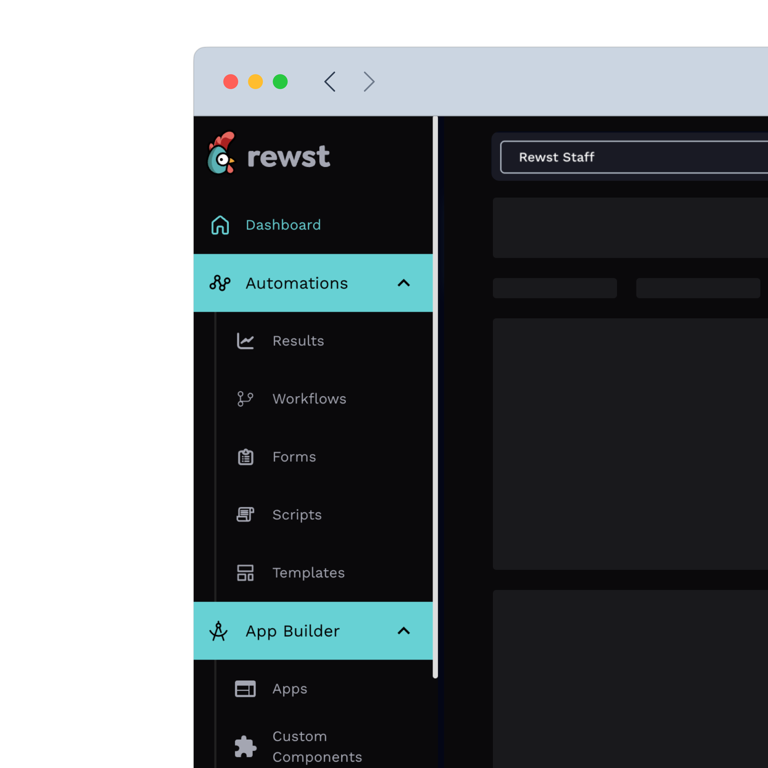
No role distinction: staff-only tools sat at the same level as Workflows and everyone saw everything
Wrong hierarchy: Live Editor at full visual weight with zero navigation clicks in production
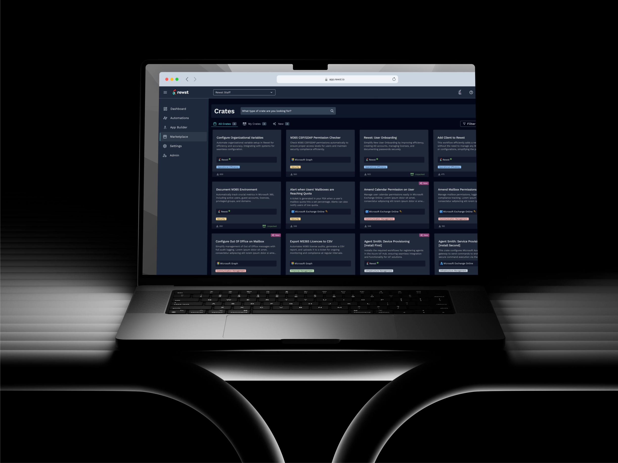
Invisible value: Marketplace and Crates declining, not a feature problem, a positioning problem
Users routing around it: saved deep links to skip the nav entirely
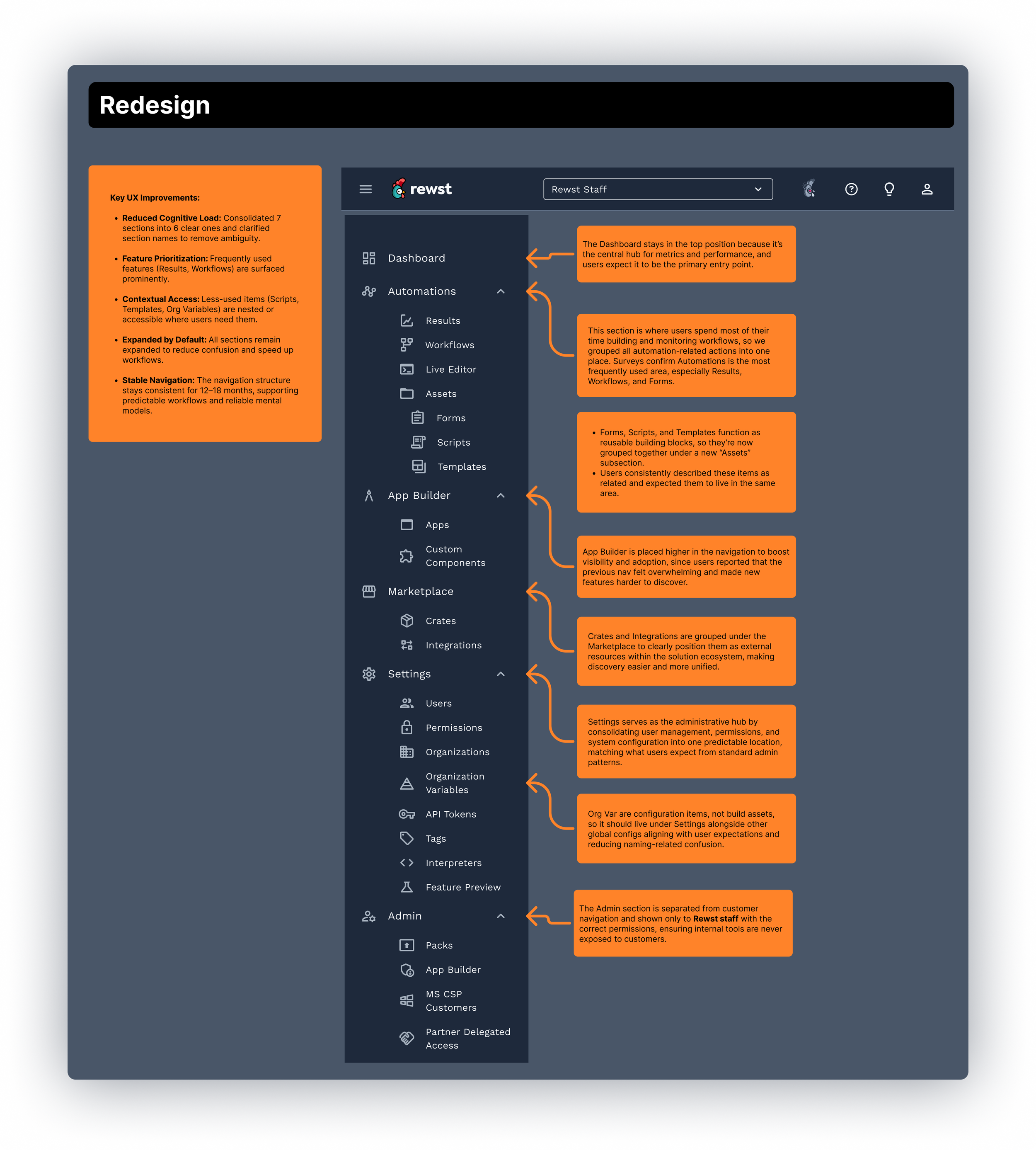
To a navigation built for how work flows
Automations first: hierarchy finally reflects that Workflows drives 758K page views a month
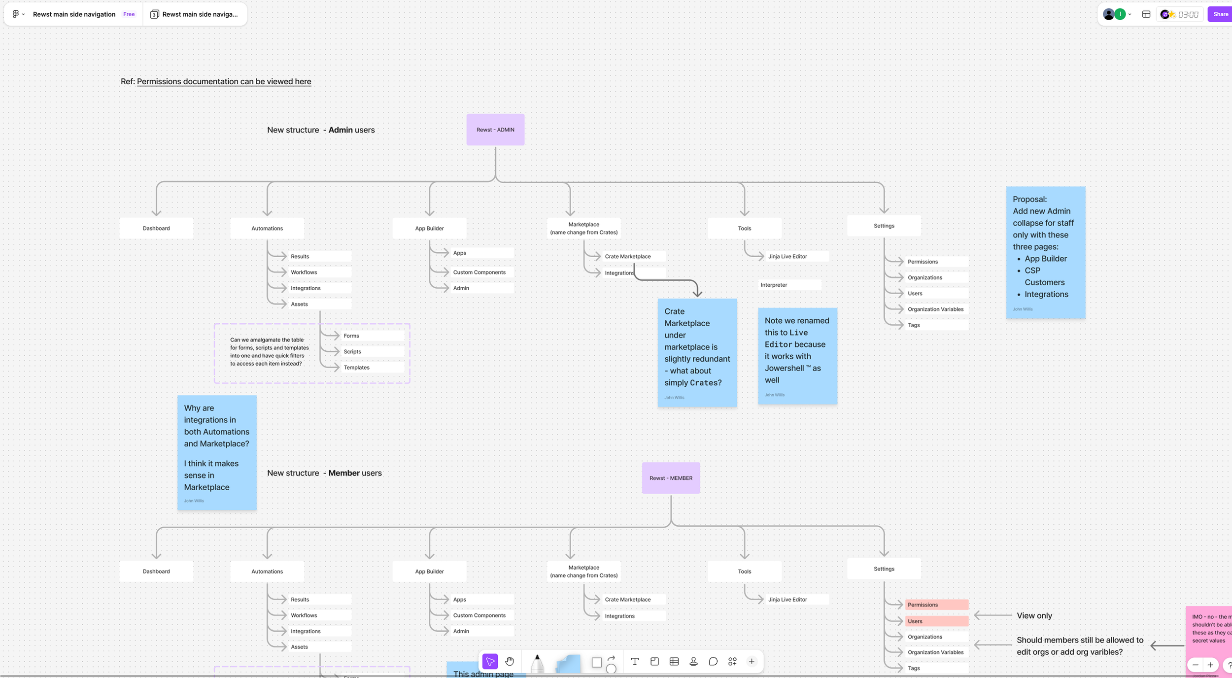
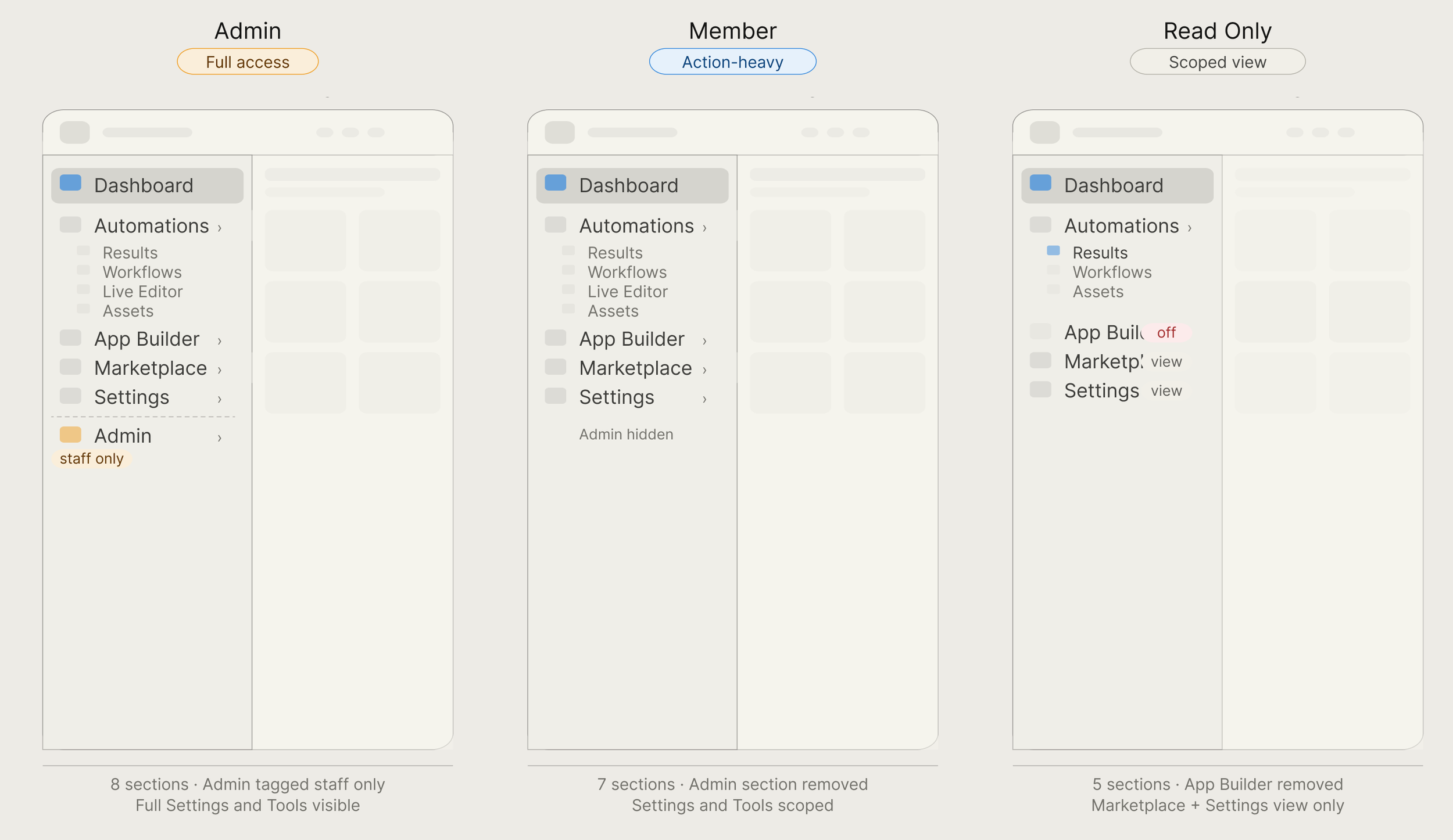
3 role-based views: Admin, Member, and Read Only, each scoped precisely, shipped simultaneously
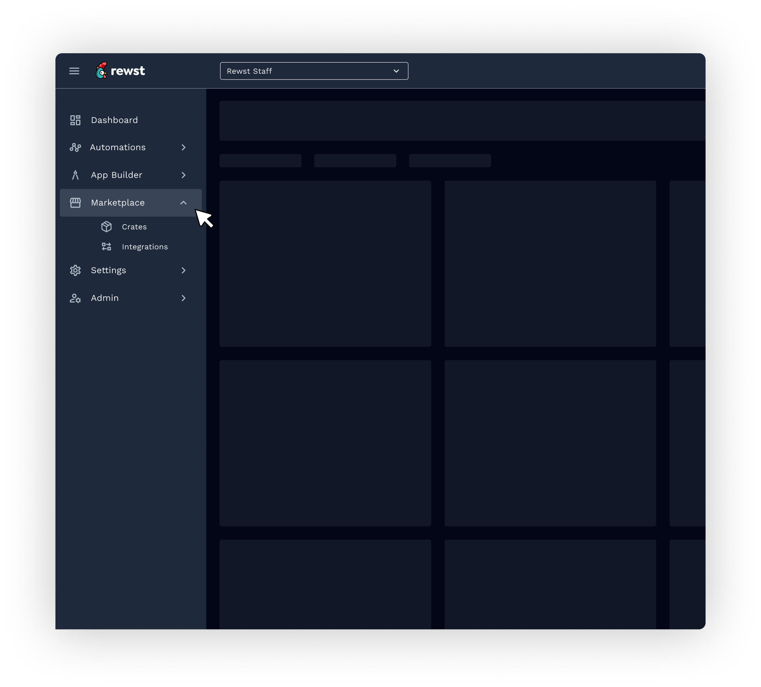
Marketplace renamed: clearer label, better discoverability, internal tools removed from non-admin views
MUI-native: zero custom components, shipped to 100% of users in under a month
Result
100%
Full rollout
All users on the new nav day one, no legacy toggle, no phased rollout
1 mo
QA to ship
Eng involvement from sprint one and documented component behavior made it possible
3
Three rolls shipped
Admin, Member, and Read Only, each purpose-built, zero rollbacks
Challenge
Redesigning a live, business-critical surface
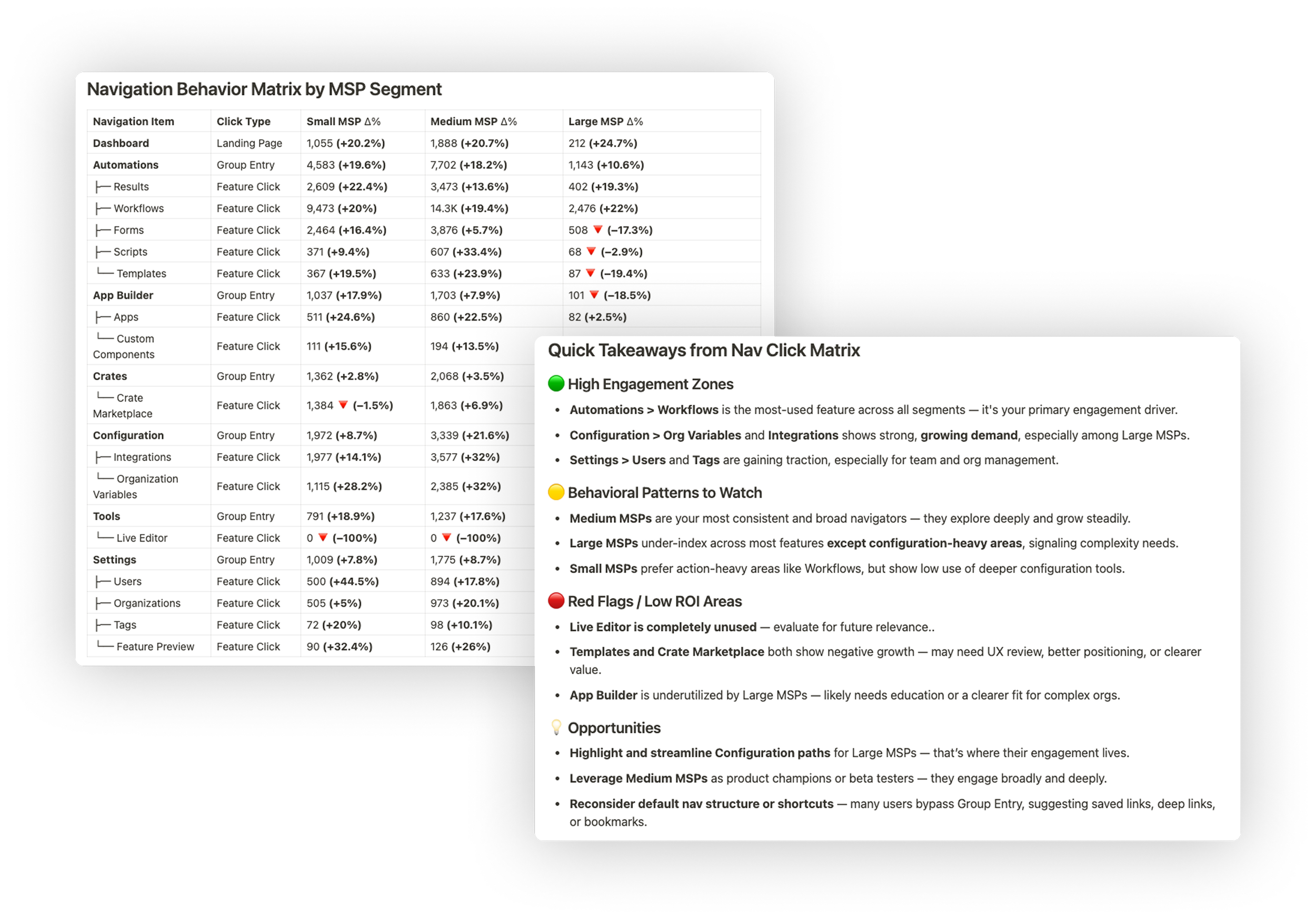
Rewst's side navigation touched every single surface in the product. Staff-only tools like Warrant and Test as User sat at the same level as Workflows. Configuration grouped Integrations and Org Variables under a label users did not relate to. The collapse button had 46 total clicks in 30 days: users had stopped engaging with the nav entirely.
The goal was not to redesign for the sake of it. It was to bring the navigation into alignment with actual usage patterns and give the team a validated plan they could ship confidently without disrupting customers mid-workflow.
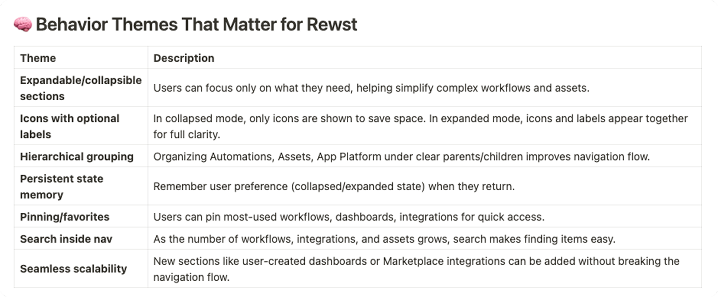
Understanding pain points
Three datasets drove every structural decision: Pendo click matrix data across all MSP segments, page view counts for every nav item over 30 days, and an internal survey run across CS, support, and PM. Each signal pointed at the same problem from a different angle. Here is what they told us and what we did about it.
01
Automations dominated but the nav did not reflect it
Workflows had 758,931 page views in 30 days. Results had 253,998. Both lived at the same visual depth as Live Editor, which had zero navigation clicks. The hierarchy communicated nothing about what mattered.
02
Users were routing around the nav entirely
Group entry clicks were dramatically lower than direct feature clicks across every segment. Users had built saved deep links and bookmarks to skip the nav. It was not helping them navigate — it was something they had learned to bypass.
03
Crates and Marketplace were declining despite being high-value
Crate Marketplace showed 18.4% decline. Templates down 19.4%. Not a feature problem — a positioning and discoverability problem baked into a label that meant nothing to new users.
04
Segment behavior diverged, one nav served no one well
Large MSPs concentrated almost entirely in Configuration and Integrations. Small MSPs stayed in action-heavy areas. Medium MSPs explored broadly. A single flat structure was not optimized for any of them.
Cross-functional collaboration
Scoping it down to ship it right
Before sketching anything, I ran a structured internal survey across CS, support, and PM, the people fielding nav confusion from customers daily. I used Rewst's internal feedback framework: set the context, define the problem with data, present work progressively, and prompt for specific guided feedback rather than open opinions.
An early engineering sync on MUI feasibility was the highest-leverage conversation of the project. It confirmed we did not need a single custom component. Drawer, Collapse, and ListItemButton covered the full nav out of the box. That conversation saved weeks of scoping. I ran async FigJam sessions where devs commented on proposed IA changes alongside the current structure, so there were no surprises at handoff, because there had been none during the process.
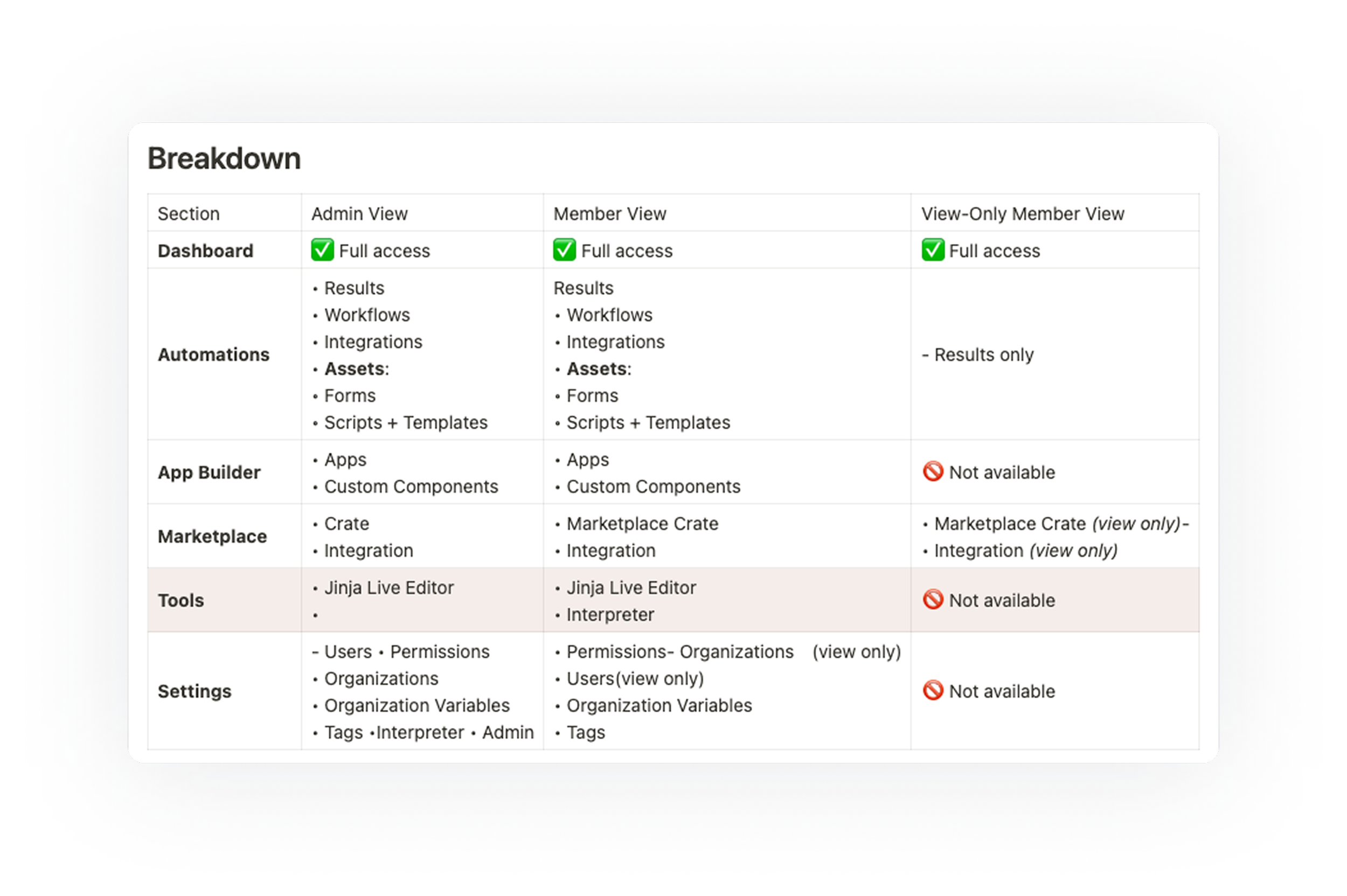
Role-based design
Designing for three audiences simultaneously
The nav had to do different things depending on who was looking at it. The constraint: these could not be three separate navs. One system with precise visibility rules at every node.
Every nav item was assigned a role matrix before a single component was built, so engineering had a permission spec, not a design mock that implied permissions. This is where the async FigJam sessions with devs paid off most. Scoping decisions made collaboratively meant there were no surprises at handoff and no rollbacks post-launch.
Side navigation behavior inspiration
Studied how tools Rewst users rely on handle scalable sidebars. The goal was not to copy patterns, but to understand what solves the same problems: supporting complexity, staying out of the way, and scaling with the platform.
Solution
A navigation redesigned around how work actually flows
Four principles drove the final structure: simplified navigation, role-specific access, cleaner groupings, and cleaner scannability. Every structural change maps back to a signal from Pendo data or a friction point from the internal survey. Nothing was a gut call.
Design exploration
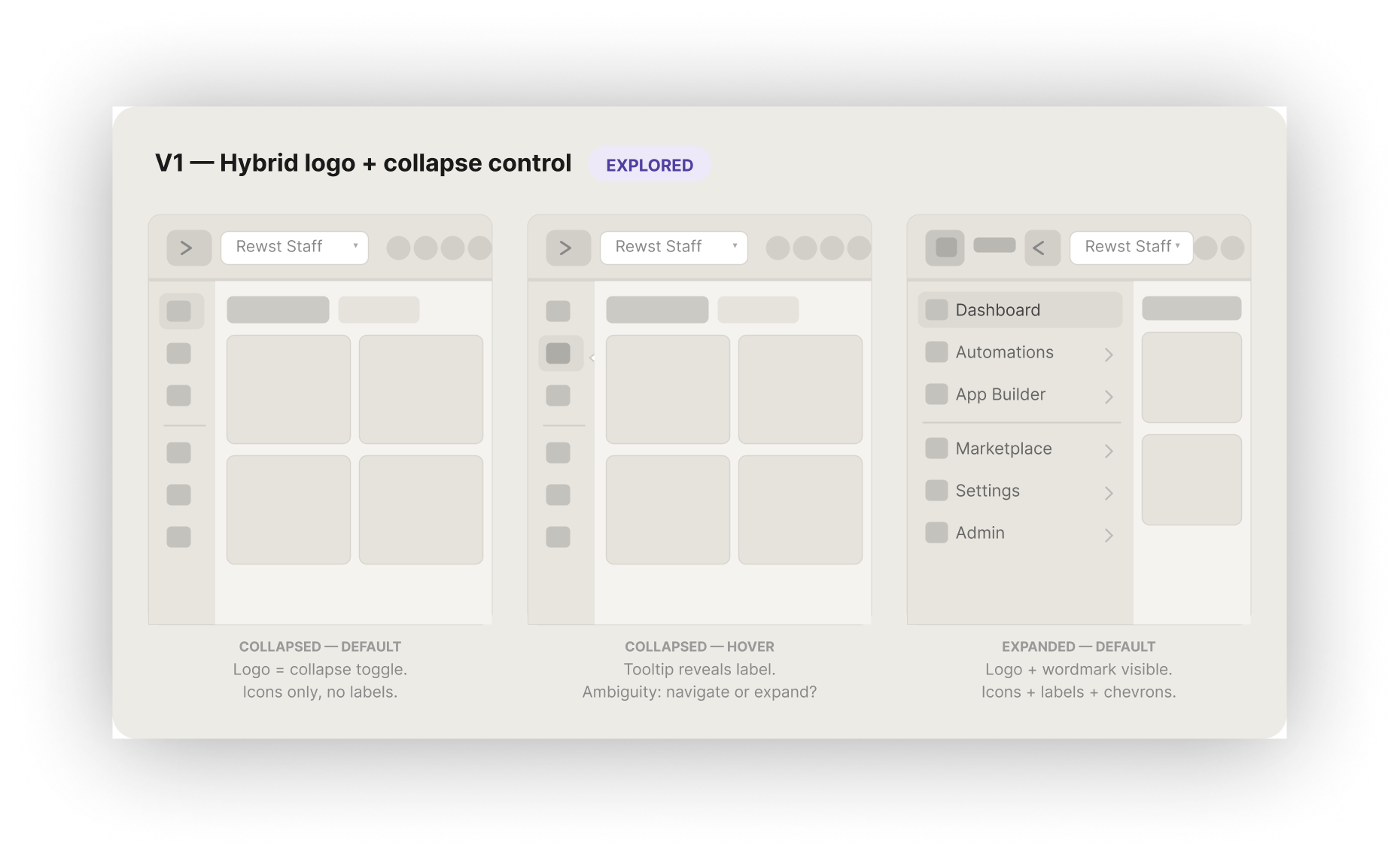
V1. Hybrid logo + collapse control
Pendo showed the collapse button had only 46 total clicks across all users, meaning the toggle itself was not being used. This version tested whether making the logo do double duty as the collapse control would encourage more engagement with the panel state. In practice, it created ambiguity: clicking the logo felt like it should navigate home, not toggle a sidebar.
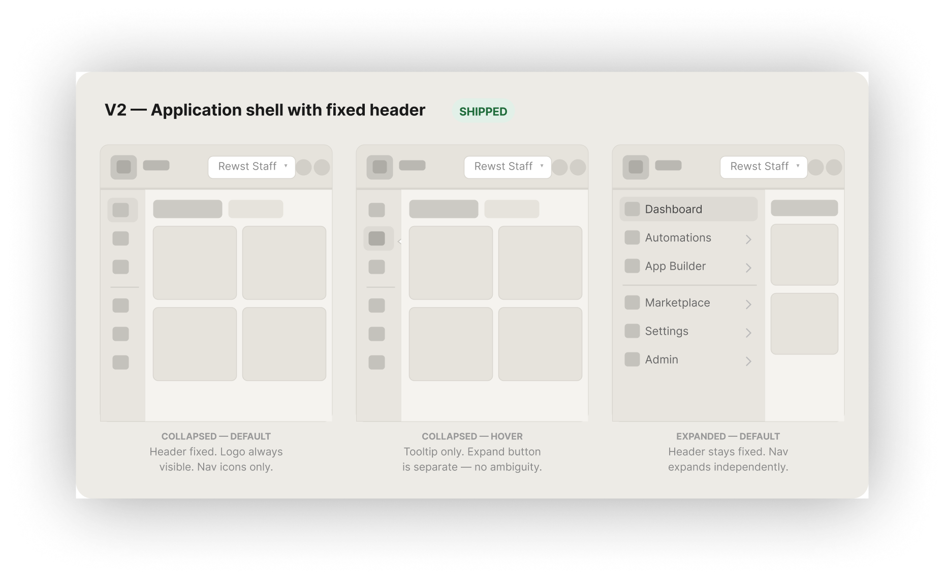
V2. Application shell with fixed header
The research pointed to two non-negotiables: the nav needed a persistent, predictable collapsed state, and the implementation had to use existing MUI components to ship fast. This version separated global chrome — logo, org switcher, user controls — into a fixed header that never moves, making the side rail a single-purpose panel. It mapped directly to MUI's Drawer and Appbar pattern with zero custom components
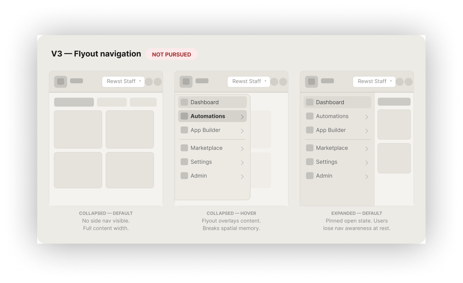
V3. Flyout navigation
Users were already bypassing the nav using saved deep links, which meant spatial memory was already strained. A flyout means users have to trigger a reveal just to orient themselves. For a platform where users navigate constantly between Workflows, Results, and Settings within a single session, that repeated friction compounds fast.
Three directions, two constraints
Before sketching, two constraints were non-negotiable: the nav needed a persistent, predictable collapsed state — Figma was the primary behavioral reference, and the implementation had to map directly to existing MUI components. These were not preferences. They were the criteria that eliminated options before a pixel was drawn.
Key features
Four structural decisions. Each one traceable to a specific signal from Pendo data or the internal survey. None of them were judgment calls, they were the only options consistent with what the data said.
01 . Results ordered first in Automations
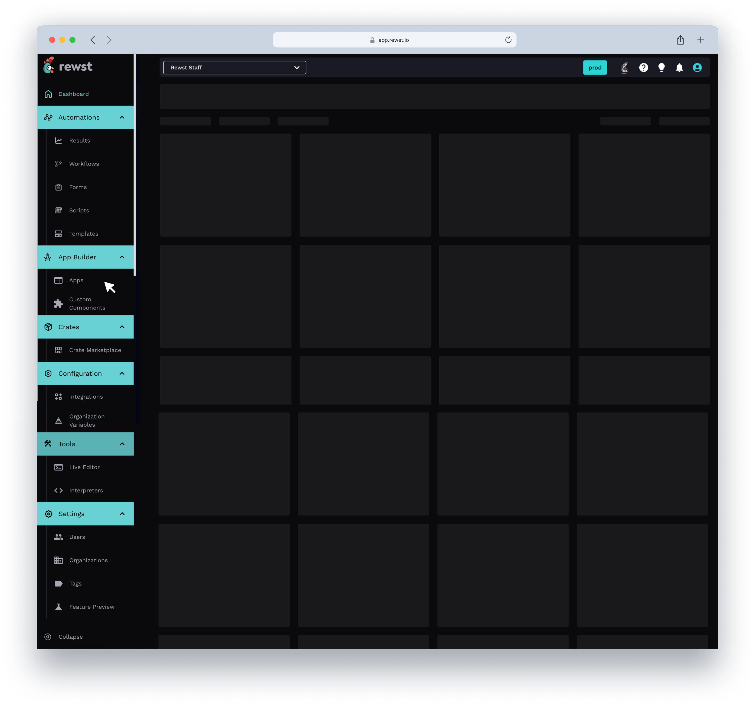
Decision: Sub-items ordered from outcome to components: Results, Workflows, Integrations, Assets, Forms, Scripts, Templates.
Rationale: Users check results before they build more workflows. Ordering from output to input matches the mental model of someone maintaining automations, not just building from scratch. Integrations moved here because you need to connect tools before building assets or forms.
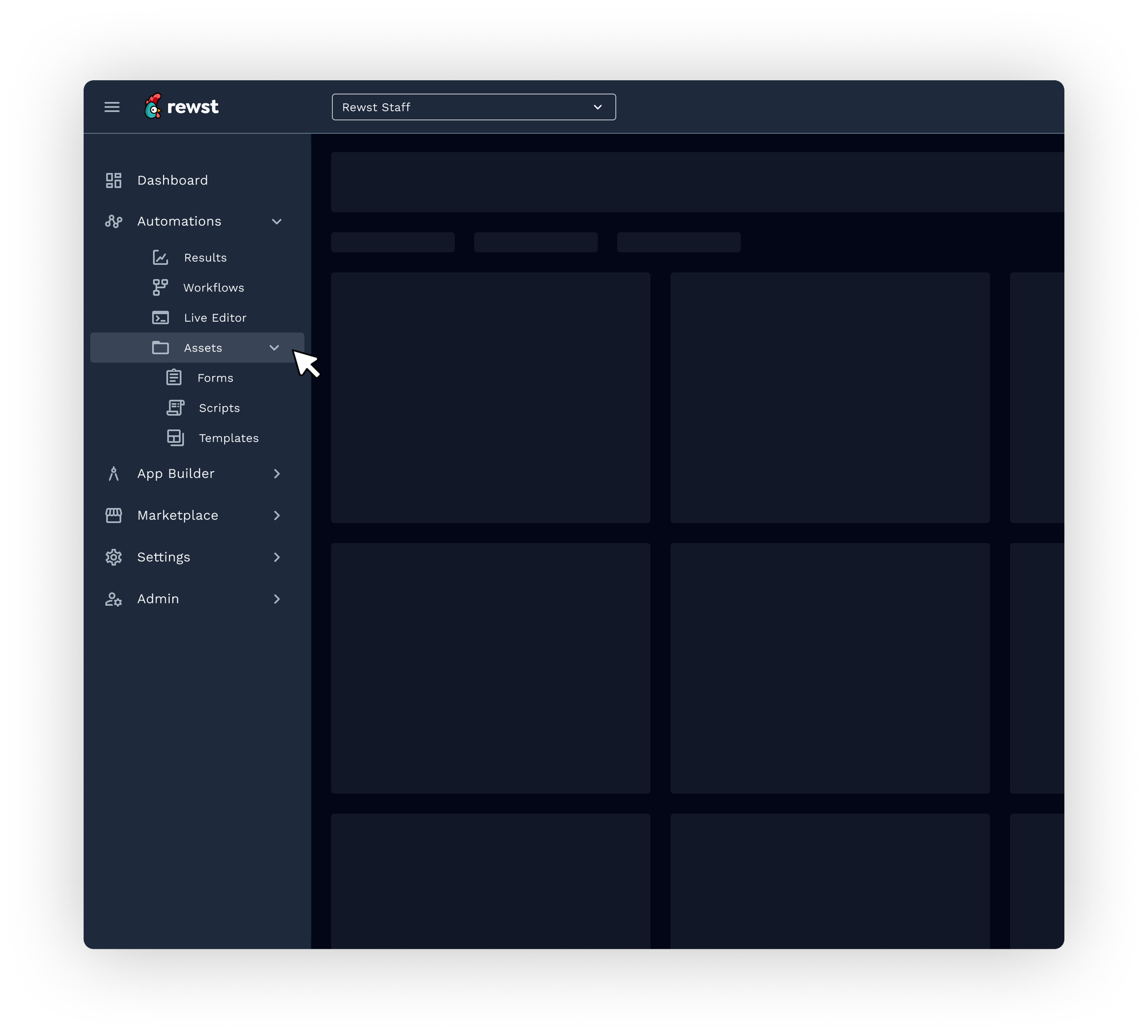
02. Marketplace renamed and elevated from "Crates"
Decision: Section renamed from Crates to Marketplace. Crate Marketplace and Integrations grouped under it.
Rationale: Crates was an internal term opaque to new users — and the declining click data backed it up. Renaming to Marketplace immediately communicated what users would find there and gave the section a clear value proposition. Positioning fix, not a feature fix.
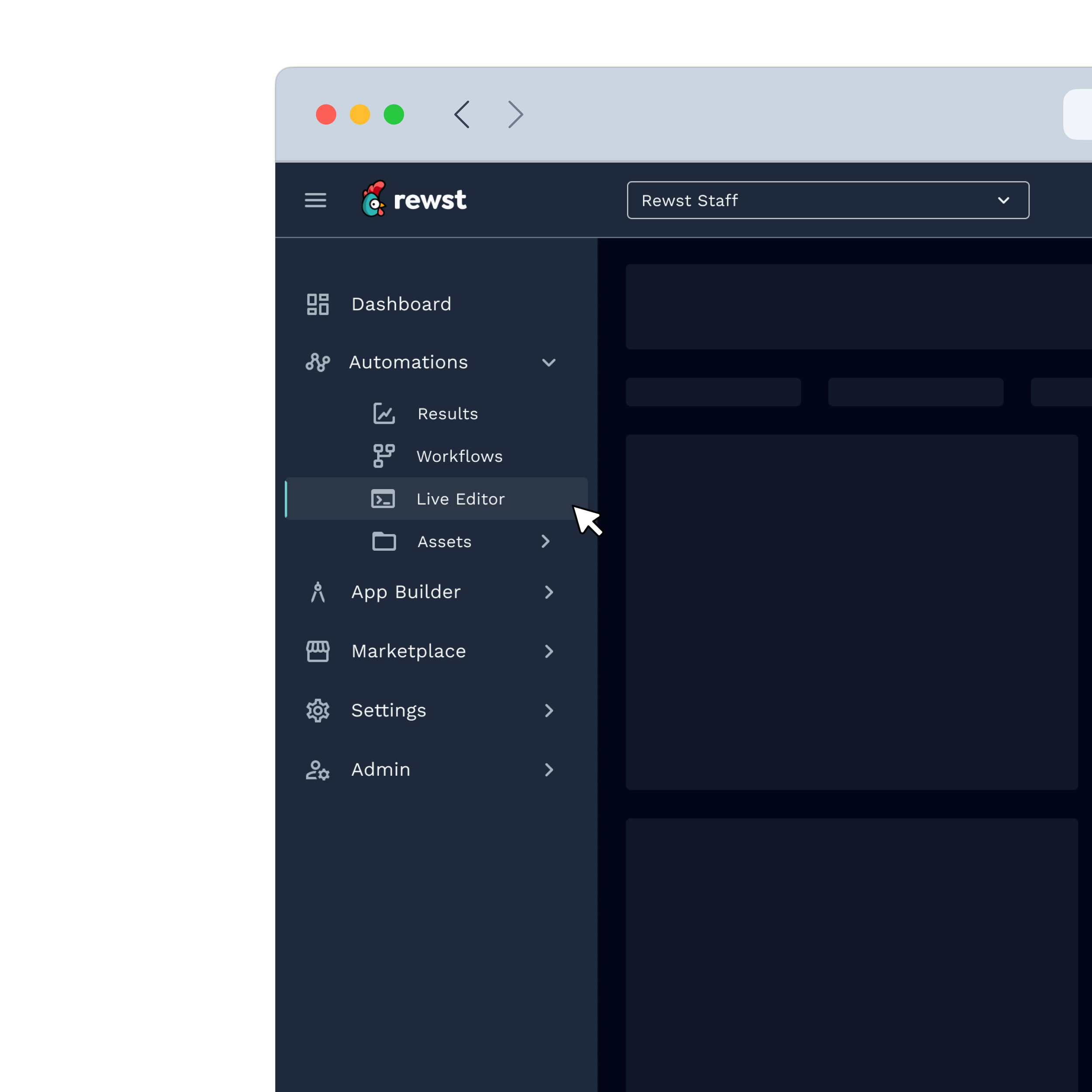
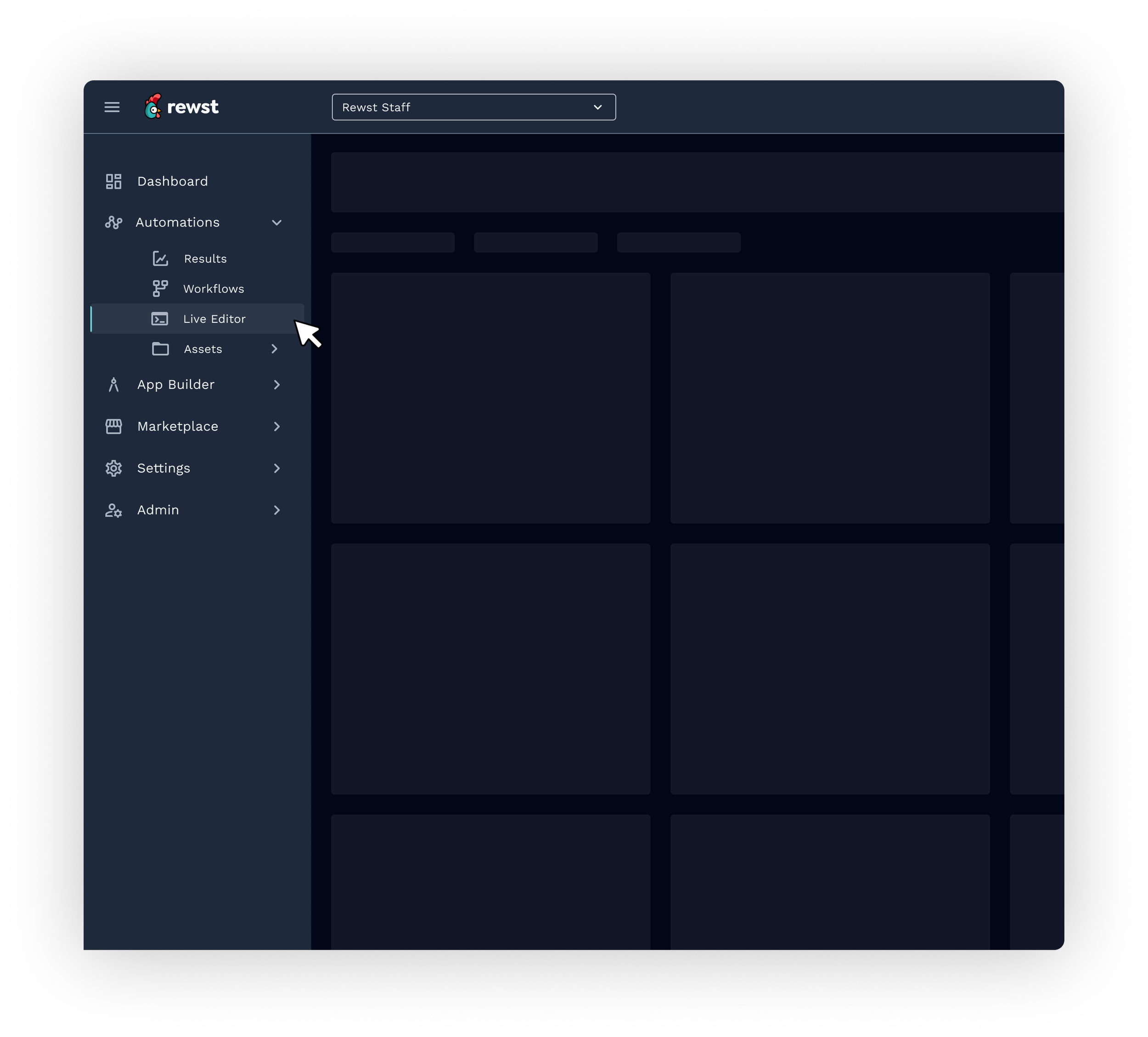
03. Live Editor retained — but scoped
Decision: Live Editor kept for Members, removed from Read Only, flagged for phase-two audit.
Rationale: Zero navigation clicks but 33,401 page views told a more nuanced story: users were accessing it via direct links. The data prevented a binary cut decision that would have been wrong. This is exactly the kind of call that requires behavioral data — intuition alone would have removed it.
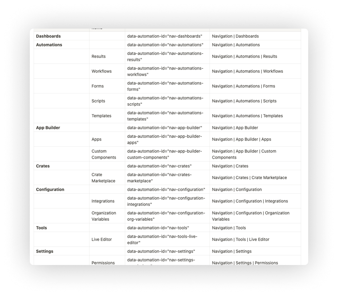
04. Pendo tags defined before development began
Decision: Every nav item from Dashboard to the collapse button was tagged with a data-automation id before engineering started.
Rationale: The same Pendo infrastructure that informed the redesign needed to immediately track how the new nav performed. Closing the measurement loop was part of the design process, not an afterthought added at launch.
A navigation that finally matches how Rewst users think.
The redesigned navigation gave Rewst's automation specialists a sidebar that reflected the work they were doing, not the history of how the platform had been built. Automations took its rightful place at the top. Role-based views reduced noise for the majority of non-admin users. Marketplace found its name. And a validated, MUI-native implementation path meant engineering shipped with confidence, not guesswork.
Shipped to 100% of users day one, no legacy toggle, no rollbacks
QA to live in under a month, documentation and component behavior specs eliminated post-launch issues
Pendo tagging built in from the start, same data infrastructure measuring the result as the one that informed the design
14 real MSP customers recruited across segments to validate IA before a single component was built